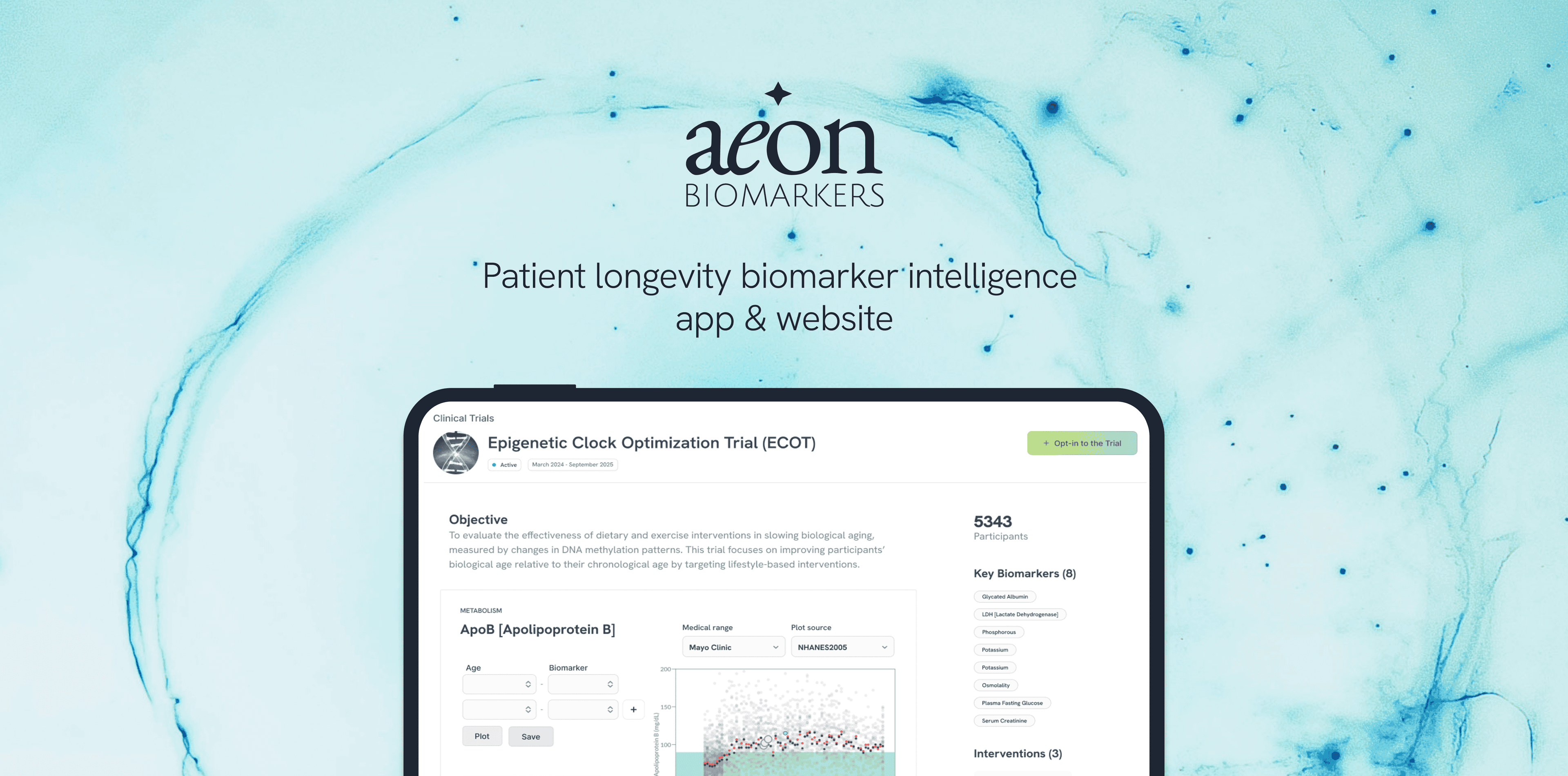
Aeon: health and aging profiles, maps & dashboards
- ROLE
- Lead Product Designer, founding team
- TEAM
- Scientific founder · medical advisors, full stack engineer · me
- MEDIUM
- Web app, website, visual design, logo
- TOOLS
- Figma
- LINK
- aeonbiomarkers.com
- STATUS
- Live behind a clinician login
AeonBio
Shabia designed AeonBio's interactive biomarker map, making biological aging legible to clinicians — used in the company's seed raise.
METRIC 01
Used in pre-seed raise
Showcased capability and need
METRIC 02
Influenced product roadmap
Pivoted from analysis to intervention
METRIC 03
Onboarded initial users
No prior product, 0-1
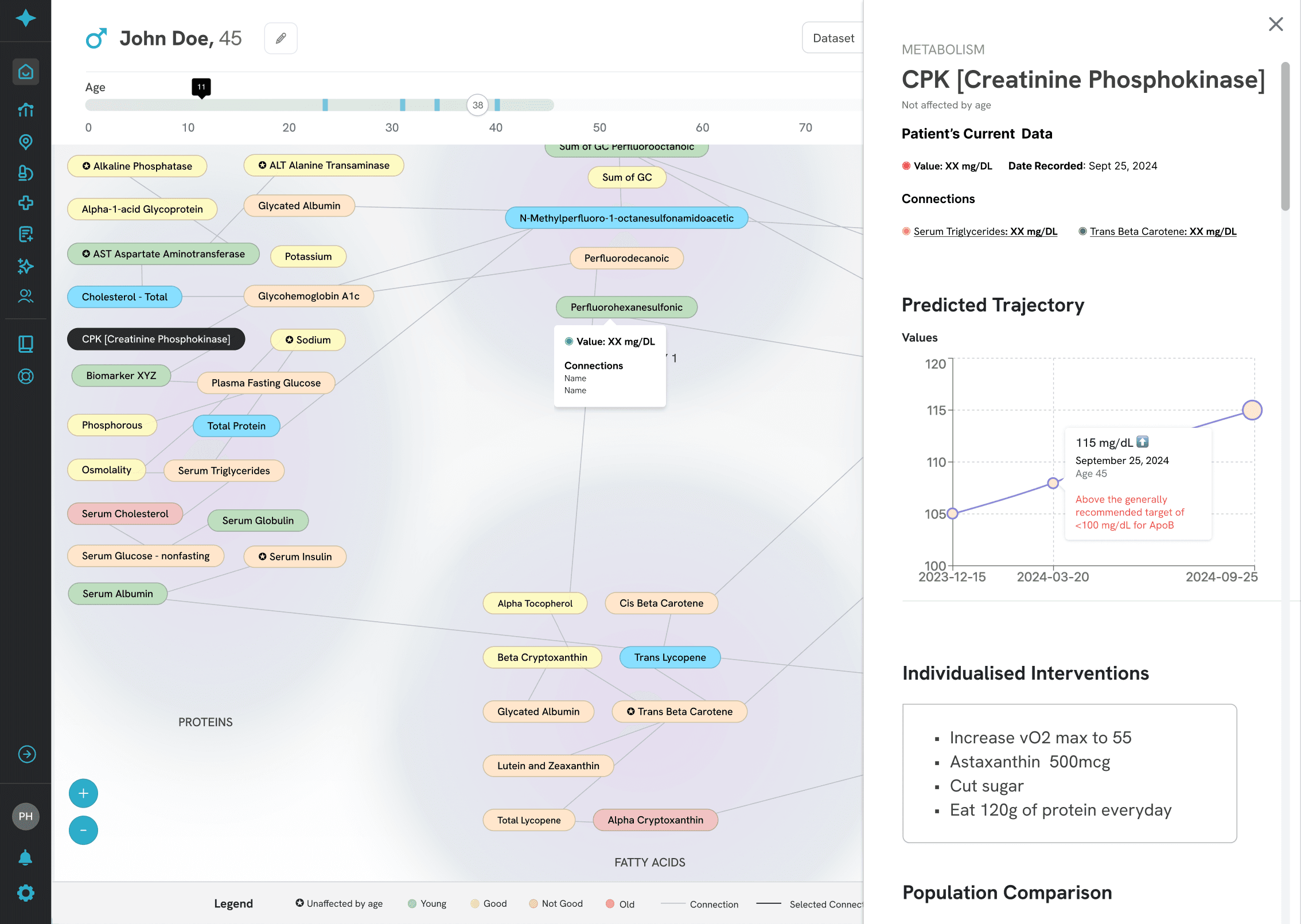
Clinicians couldn't see how a patient's biomarkers influence each other or drift with biological age. The data existed, nothing made the relationships readable, comparable over time, or quick to scan.
The bet: turn the spreadsheet into a map, and a clinician grasps a patient's aging profile in seconds, not hours.
Who and why
Designed for three users
The hard part
No user data and no reference product existed. So I designed for cognitive load first - a clinician should read a patient before reading a number.
What we prioritised
Four principles, every decision below answers to them:
A journey through wireframe sketches to visualise biomarker readbility and categorisation.
Relationship-map studies
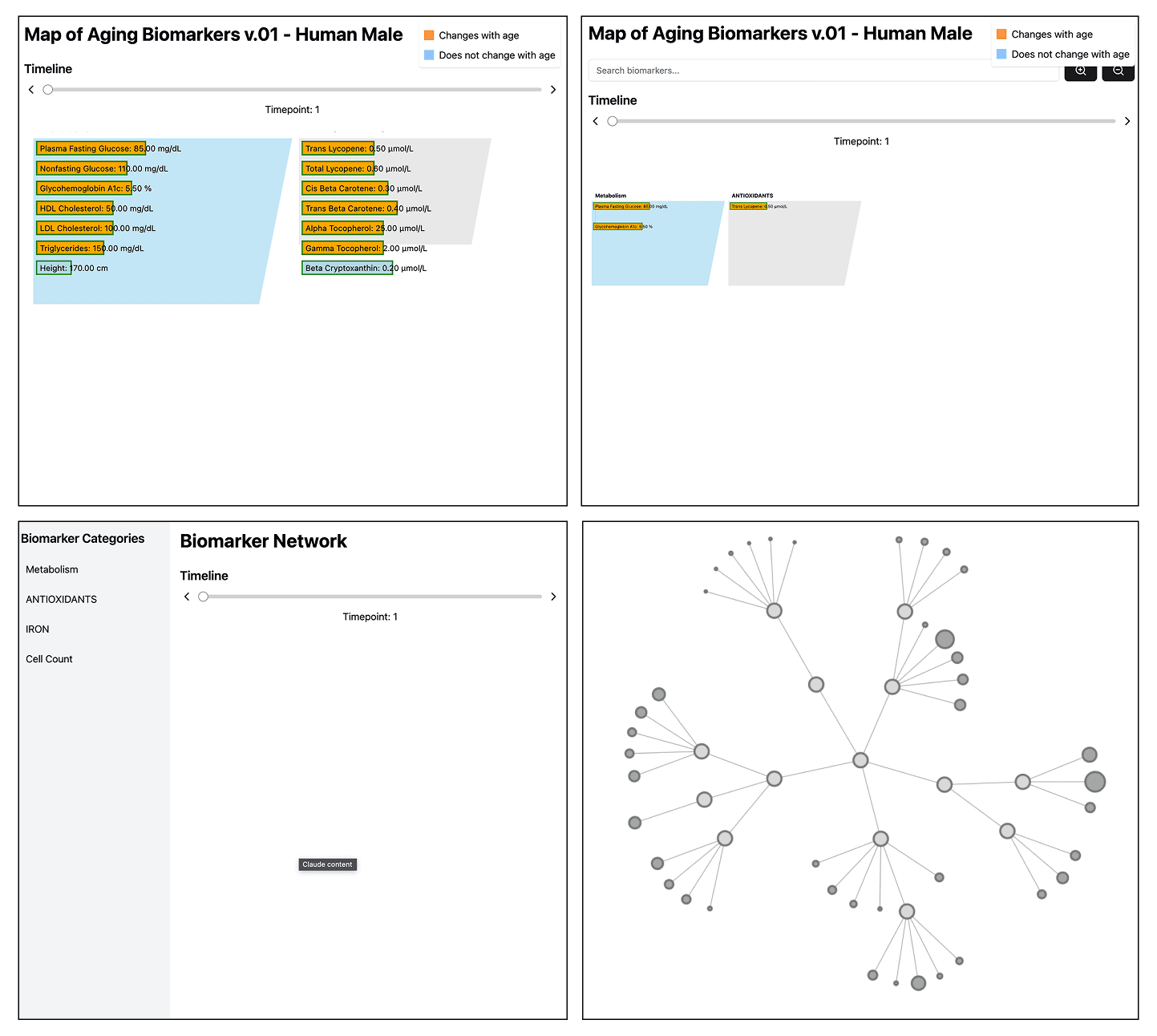
A journey through wireframes, from first sketch to shipped product.
Decision 1: Every element, on one screen
Principle: readable at a glance
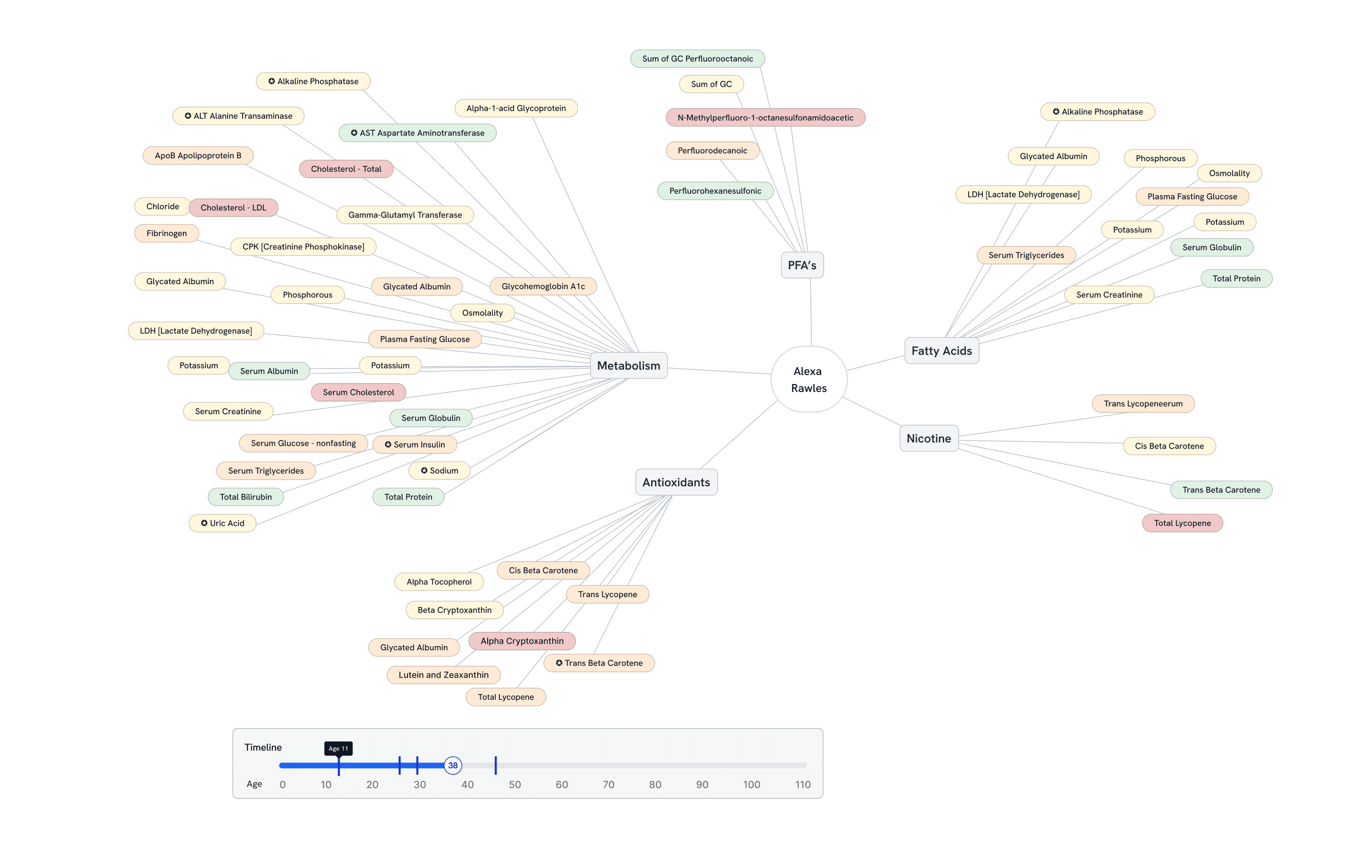
The first full-screen attempt brought every piece together at once — the map itself, category filters, a global search, and an age timeline running along the bottom.
It proved the layout could hold all of it without a second screen, but it was also the version everything after this had to simplify.
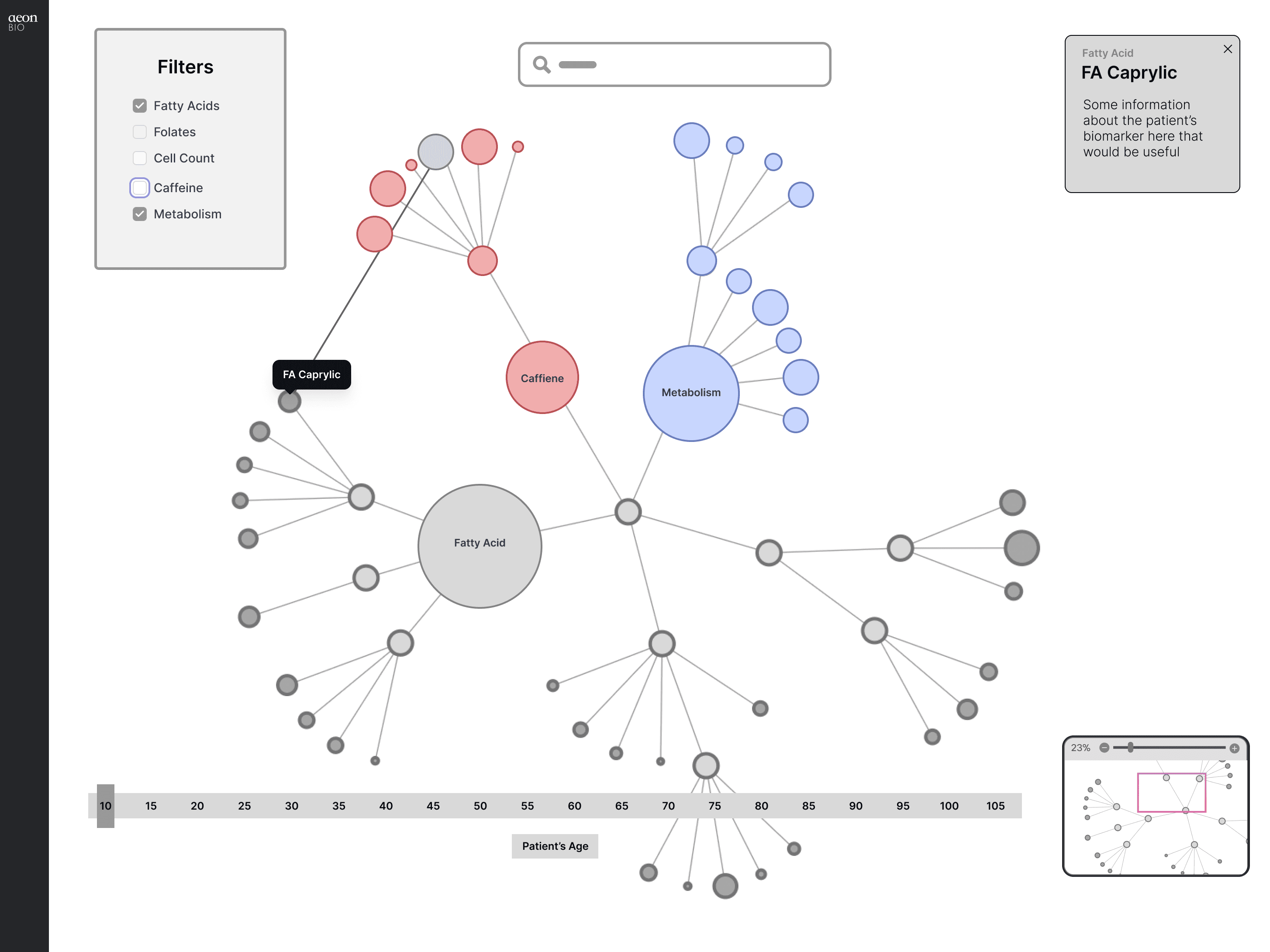
“Before it could be simple, it had to exist as one whole screen.”
Decision 2: Colour carries age, not just the value
Principle: readable at a glance
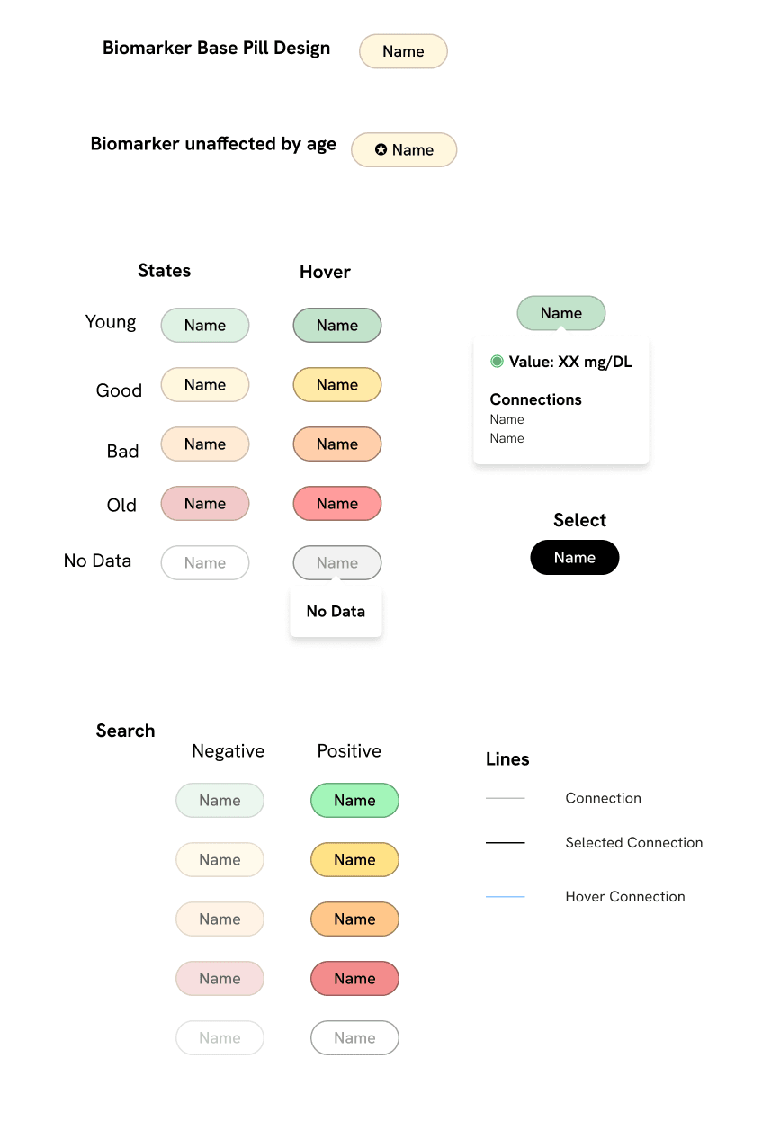
With a named patient in the frame, each node picked up a colour for its age state — youth, good, at risk, aged — and the surrounding biomarkers were grouped into labelled clusters like Metabolism, Fatty Acids and Antioxidants.
A clinician could now read a patient’s overall pattern in the colour alone, before ever opening a single value.
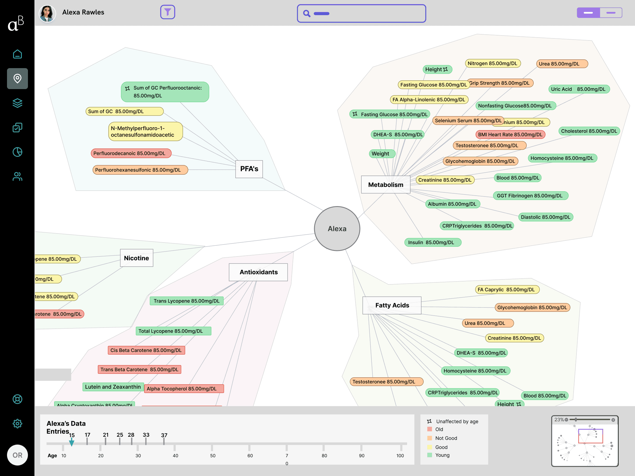
“A clinician shouldn't have to read the map to understand the patient.”
Decision 3: Cutting the clutter from every node
Principle: readable at a glance
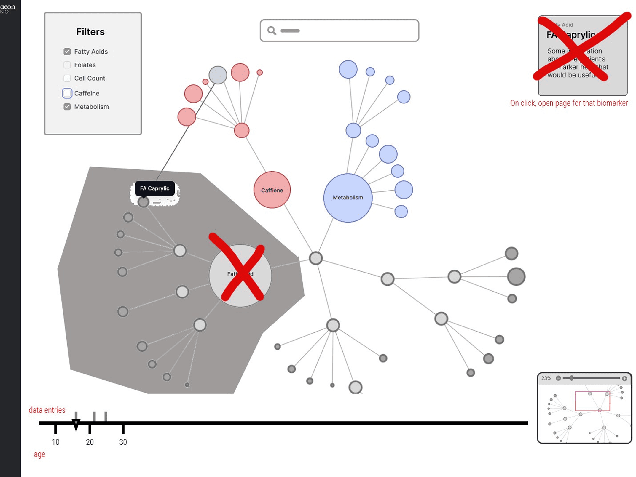
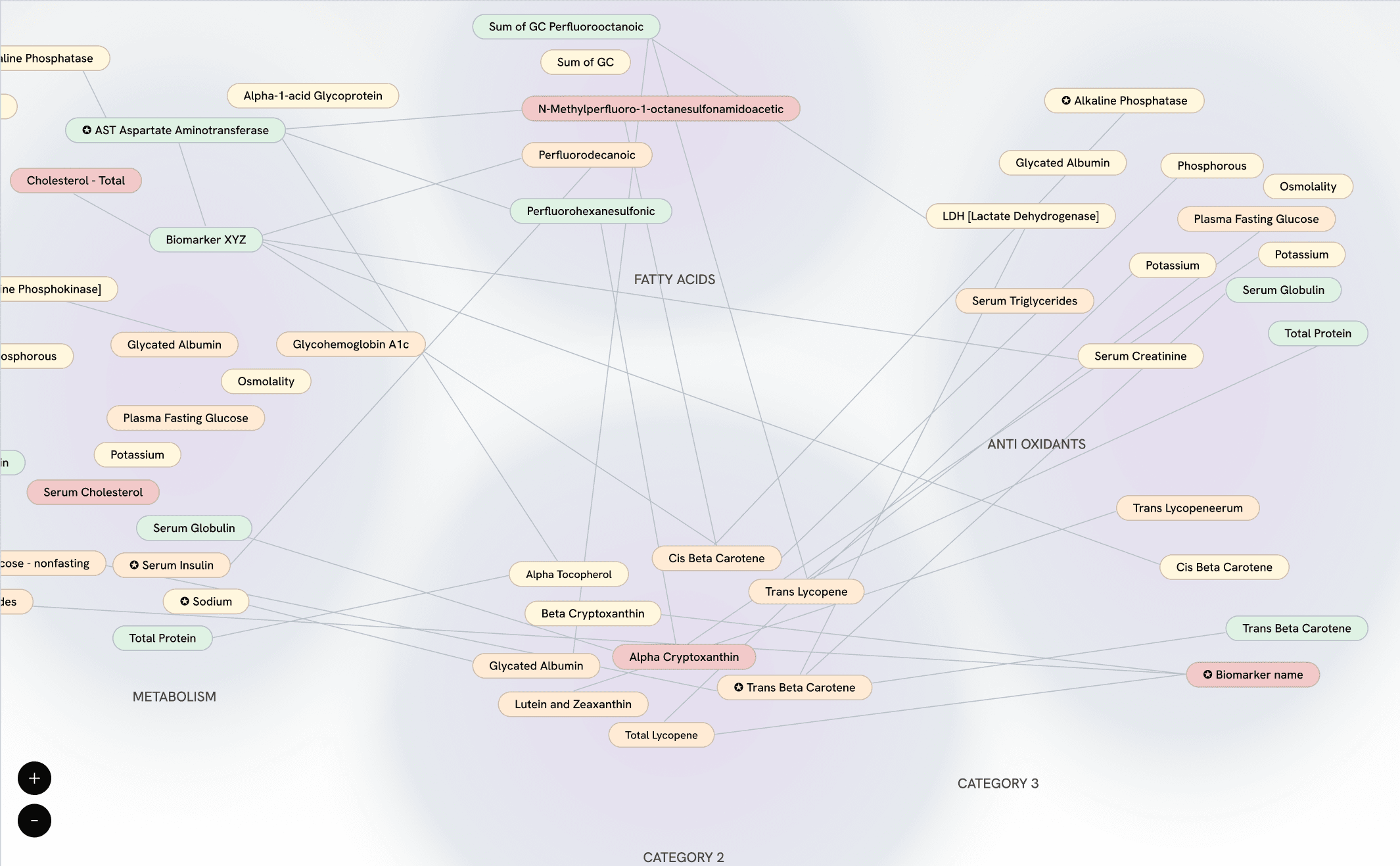
With every value printed on every node, the map read as noise rather than a pattern.
I marked up the screen directly to show what had to go, then rebuilt it: raw values moved to hover, node colours lightened, and connection lines redrawn so relationships stayed legible under the calm.
“Density isn't depth. The map earns trust by staying quiet.”
Decision 4: AI predicts, the clinician decides
Principle: AI predicts, human decides
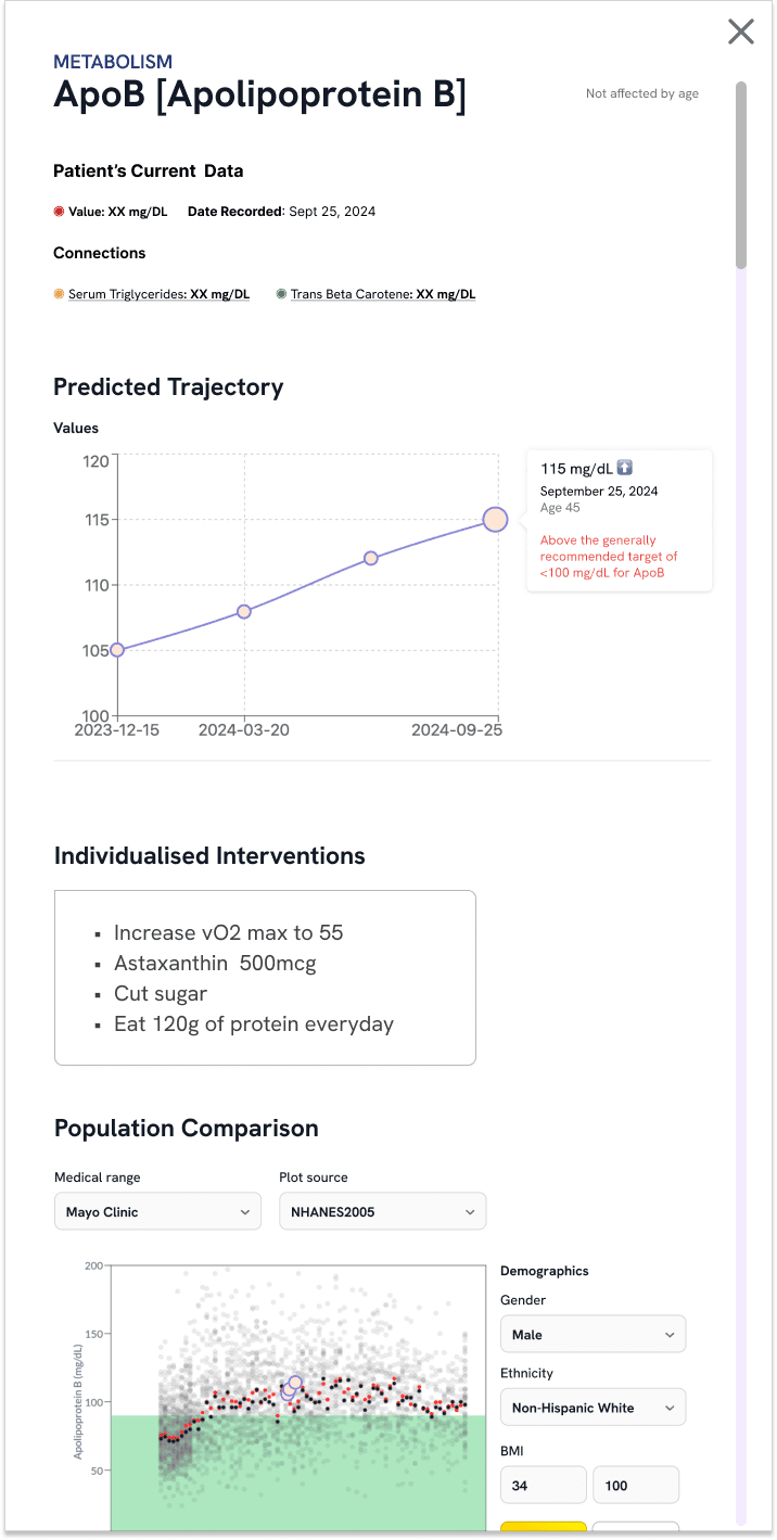
The first side panel showed current values, linked biomarkers, and an AI-predicted trajectory — enough to open the conversation, but not enough to act on.
The shipped version adds AI-suggested interventions and a population comparison in the same panel, so a clinician can move from "what is this" to "what would I do" without leaving the screen. AI proposes; the clinician keeps the call.
“In clinical tools, AI is a second opinion, never the decision.”
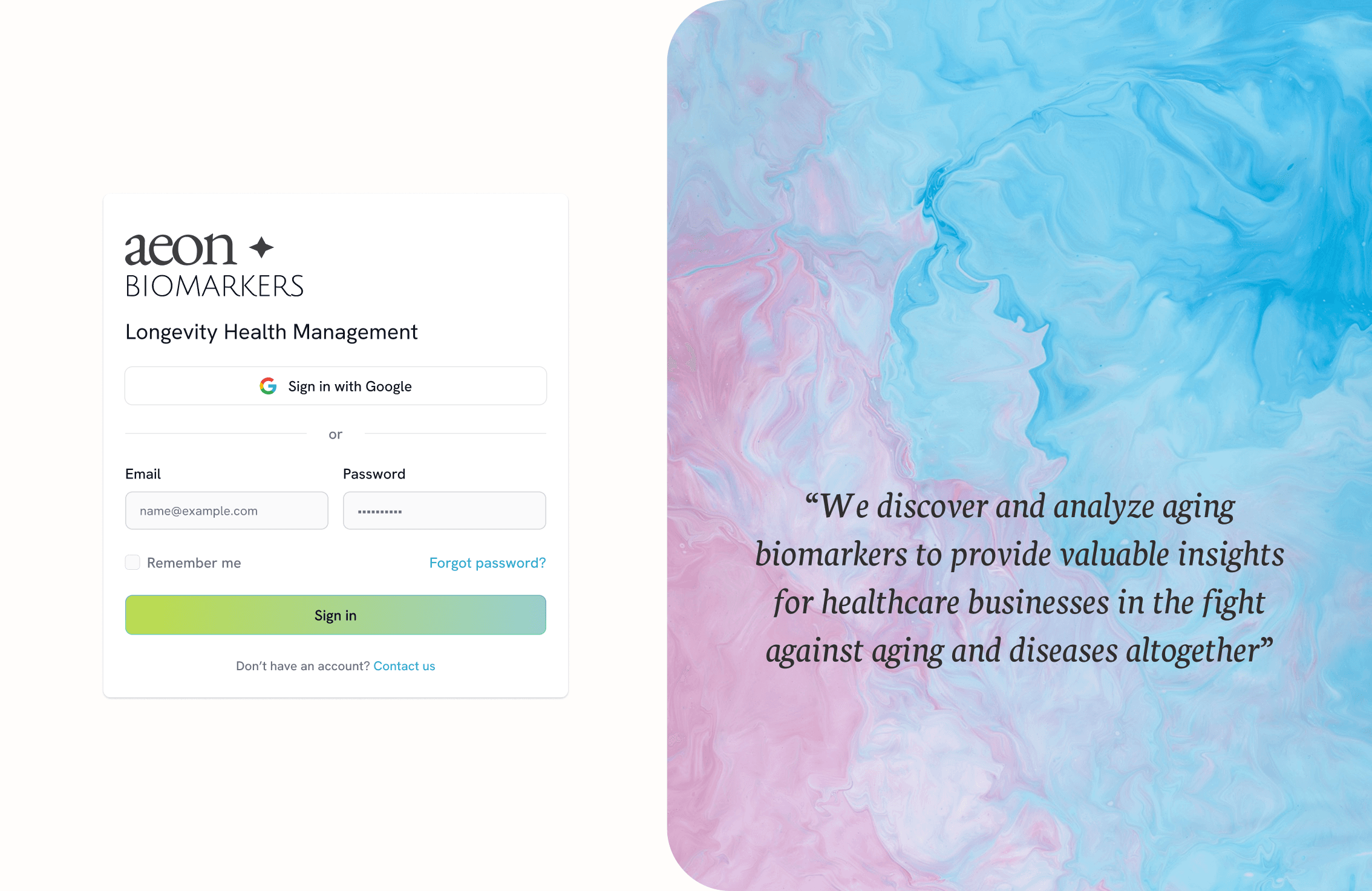
Login
Google sign-in or email and password, with the product’s positioning stated right on the auth screen.
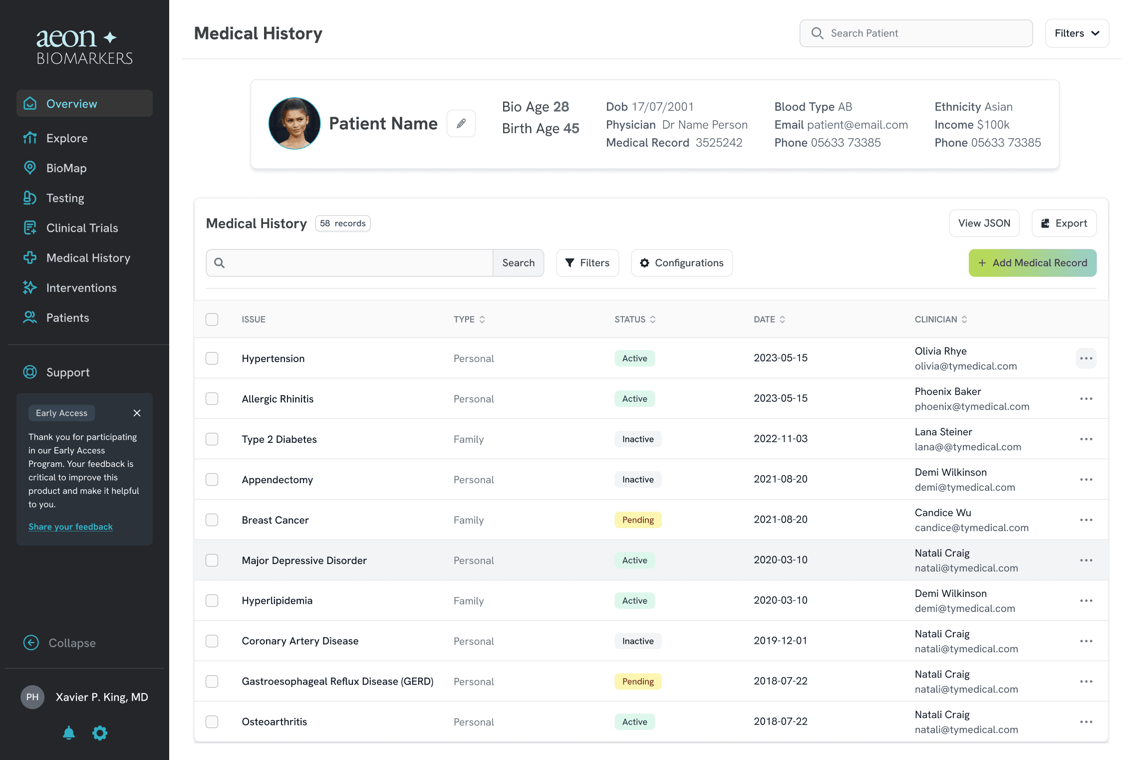
Patient records
AI parses medical history into structured records for more accurate biological-age calculation.
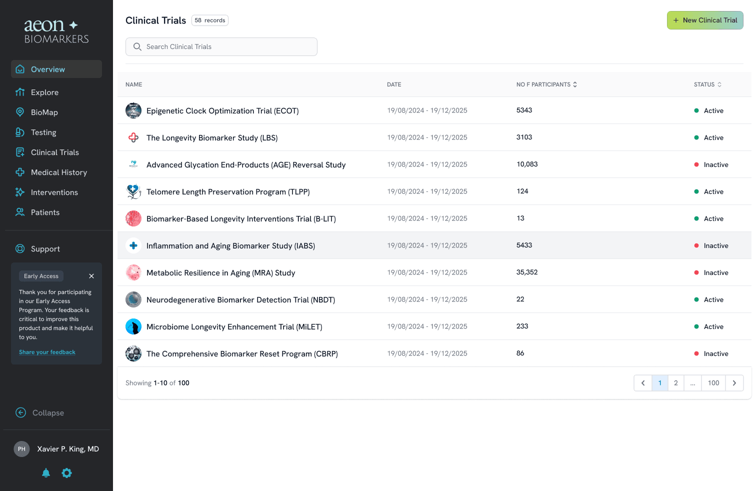
Clinical trials
A searchable directory of active and inactive longevity trials, with participant counts and status at a glance.
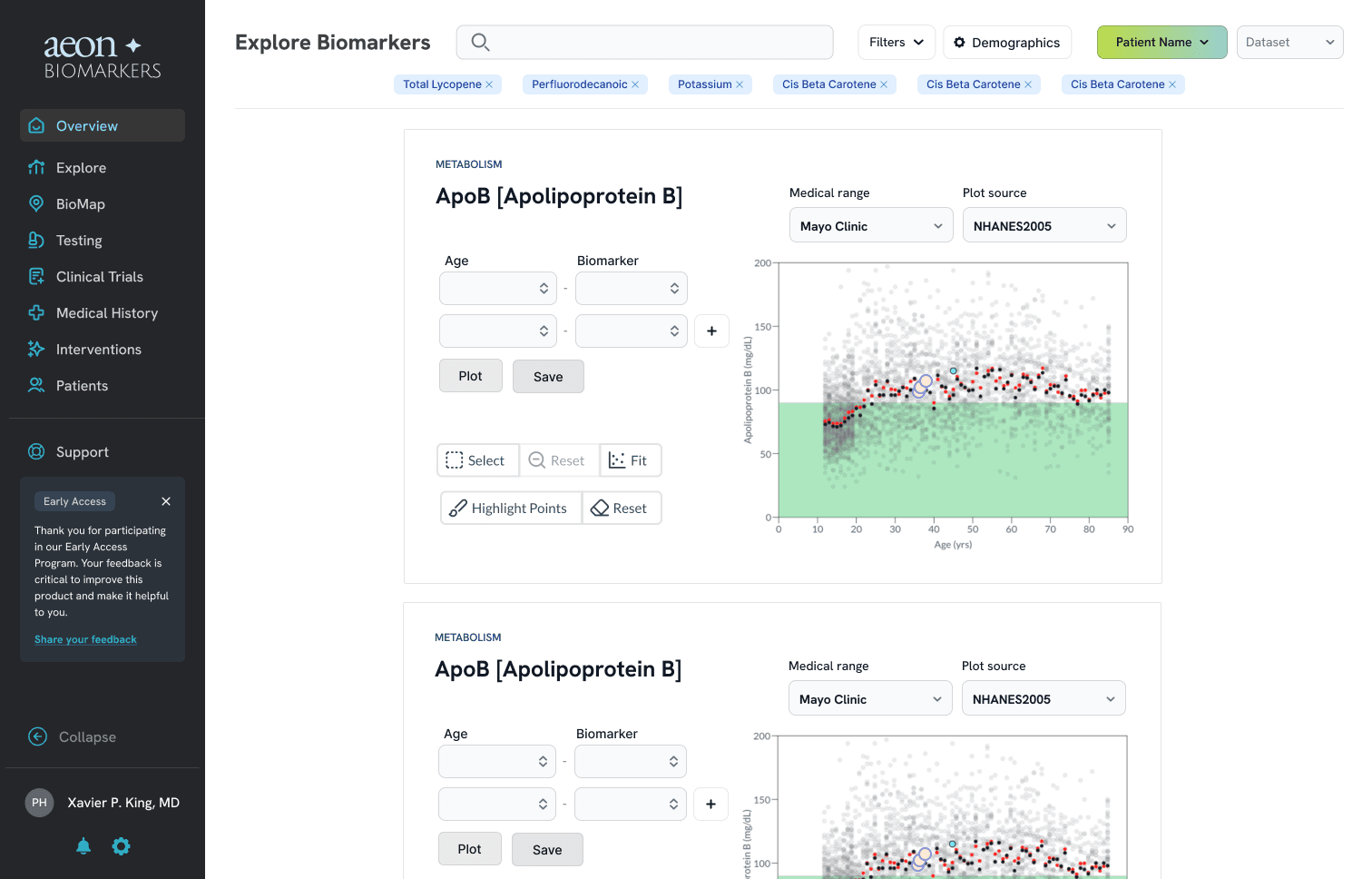
Explore biomarkers
Plot a patient’s biomarker against population reference ranges by age, sourced from clinical datasets like NHANES.
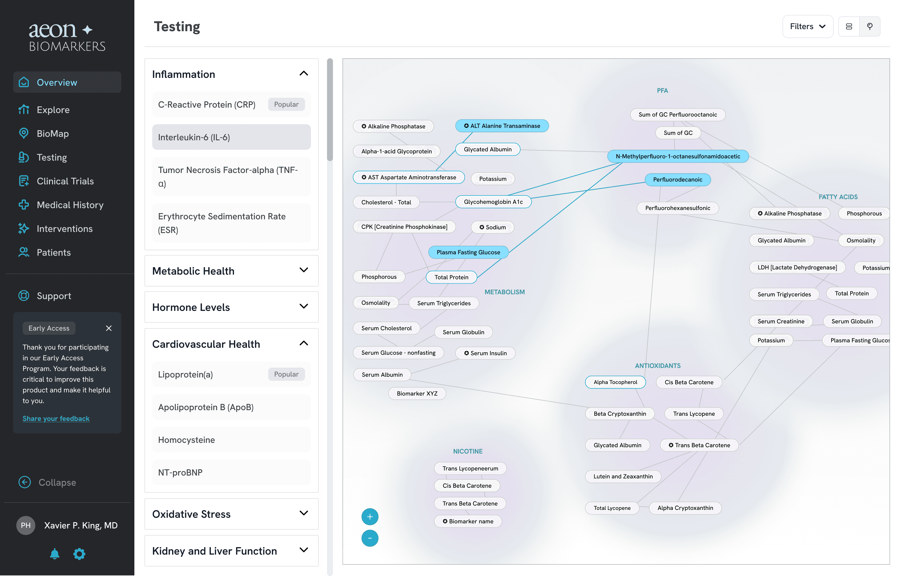
Testing
Order biomarker panels by category, mapped directly onto the same relationship network used to read a patient.
Simple, easy to scroll, designed to understand the product value at a scan.
Website preview
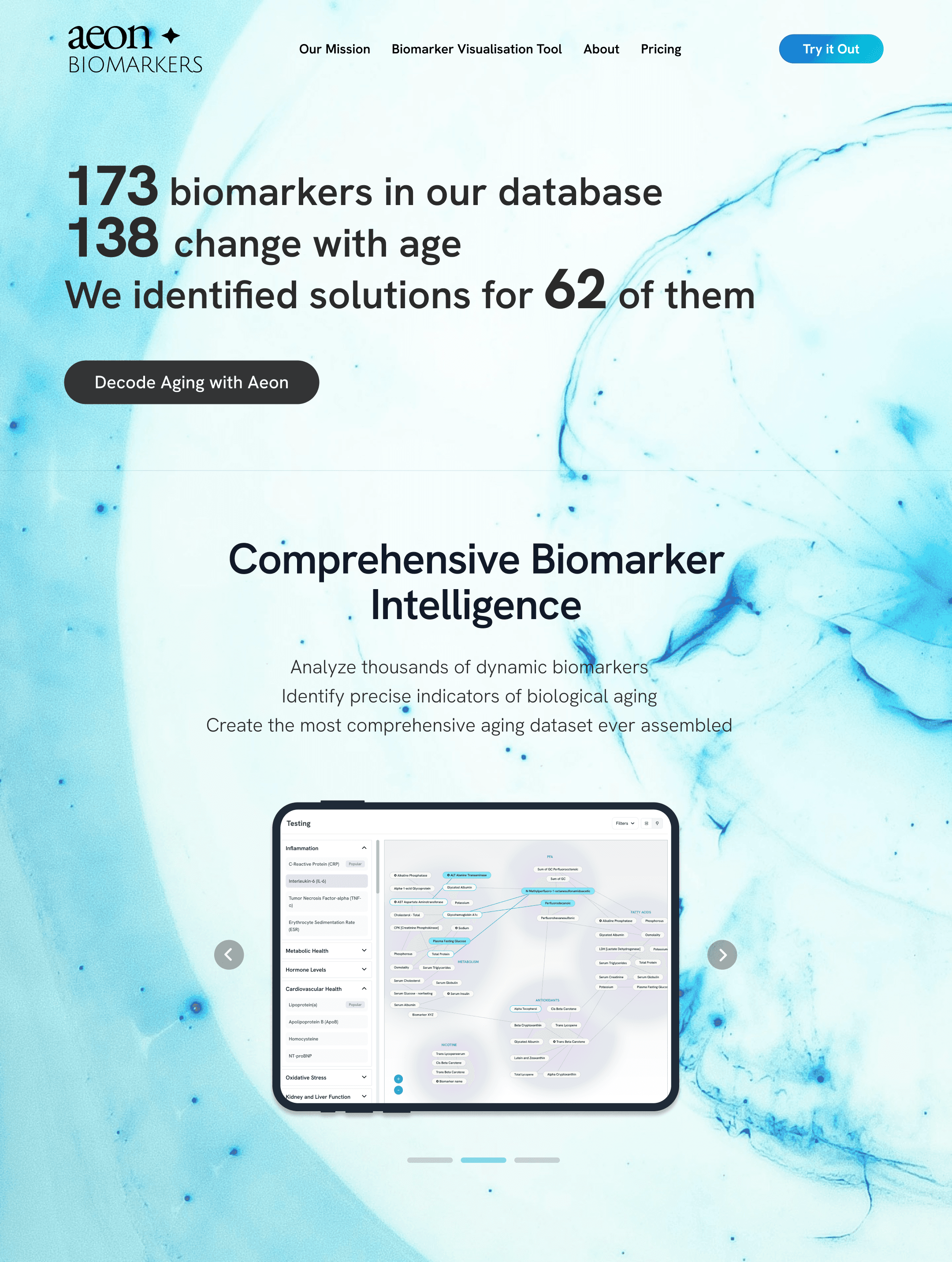 Scroll the image
Designing in an empty field
No reference product existed, so I explored how node-relationship maps work in other domains before committing to one.
An AI-native product
Trajectory prediction, record parsing and trial analysis are AI features I had to design trust into — confidence, correction, human override.
Judgement led
Every clinical-facing AI output is a suggestion, never an answer. A design principle, not a technical limit.
STAKEHOLDER CLARITY
Vision legible
To non-technical stakeholders
MVP
Foundation set
Foundation for MVP
FIRST USERS
Onboarded
The first 3 clinics joined as early adopters
What I Learned
Designing in ambiguity — with no user data and no template — is its own skill. Working with a scientific founder taught me to turn complex medical goals into UX patterns.
Would Do Differently
Get the map in front of real clinicians sooner; earlier hands-on sessions would have caught interaction friction before the build.