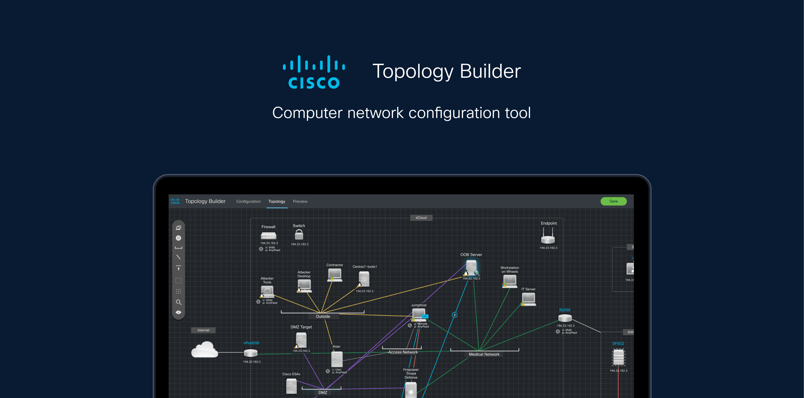
Topology Builder: recreating networkg-diagramming tool from poc to b2b Saas.
- ROLE
- Lead UX Designer (the diagram view)
- TEAM
- Co-designer (table-config view) · product manager · project manager, engineering team
- MEDIUM
- Desktop web app
- TOOLS
- Figma · Miro · iPad + Adobe Sketch
- CLIENT
- Cisco (dCloud)
- STATUS
- Shipped to new user groups
Topology Builder
Shabia redesigned Topology Builder, an internal Cisco network-diagramming tool, into a product real teams could use, reaching V1 feature parity.
METRIC 01
Reached V1 feature parity
vs. the legacy tool
METRIC 02
Onboarded new user types
Beyond the original demo-dev audience
METRIC 03
Remote team of two designers
Delivered fully remote, Covid lockdown
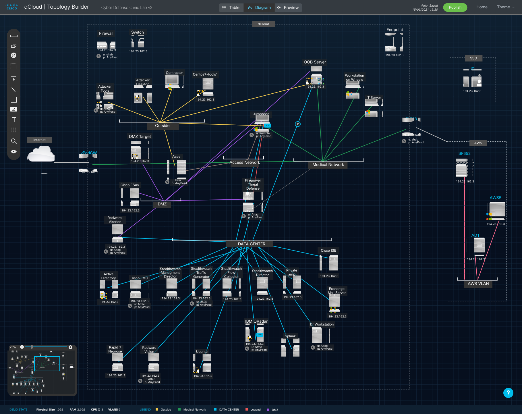
Topology Builder was built ad hoc by engineers with no UX — a tool for demo developers only. Then remote work made it critical infrastructure for teams who'd never been designed for. It couldn't show a full solution, couldn't handle complex diagrams, and had no way to find anything.
The brief: hit feature parity with the old version, then make complex network diagrams genuinely easy to read, build and search — for user types the tool was never meant to serve.
System analysis, five interviews, one short survey
Findings
A small selection of findings
Problem → solution, mapped
Problem → solution map
I turned the findings into a problem→solution map that drove the whole design:
Finding 1
Hard to find items
Refined solution
map search
Finding 2
Can't see connections
Refined solution
clearer lines
Finding 3
Too cluttered
Refined solution
pan, zoom, navigator
Finding 4
Can't show externals
Refined solution
on-diagram boundaries
Finding 5
Needs non-functional items
Refined solution
freehand drawing
I quickly sketched out ideas so solve stated problems. Here is an example.
Search
Idea 1

User types in a term; the result is highlighted and zoomed in on the diagram, with the settings panel open.
Idea 2
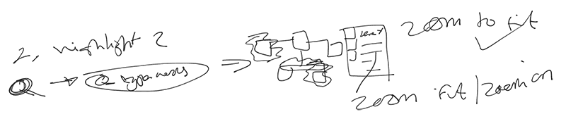
Like idea 1, but highlights all potential results, with settings opened on a side panel and each device on its own tab.
Idea 3
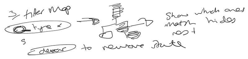
Fades incorrect results and leaves matches at full opacity, with a clear button to reset the search state.
Idea 4 — shipped
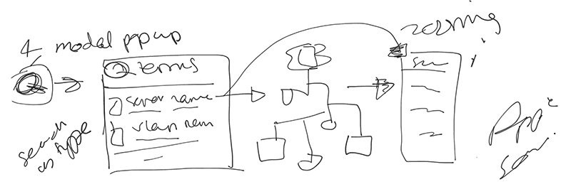
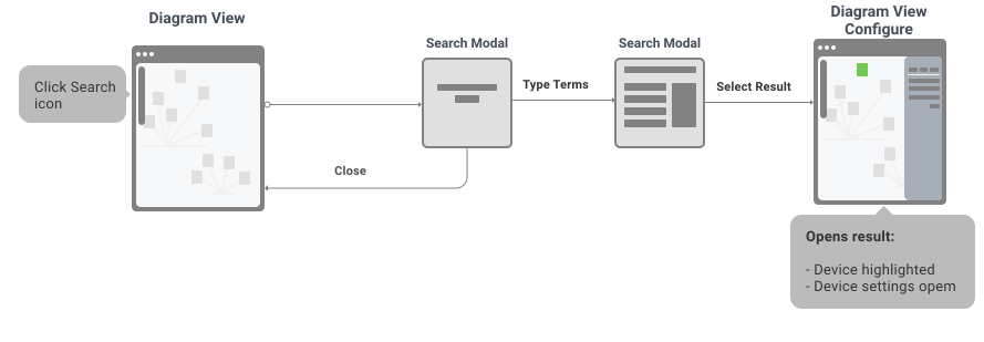
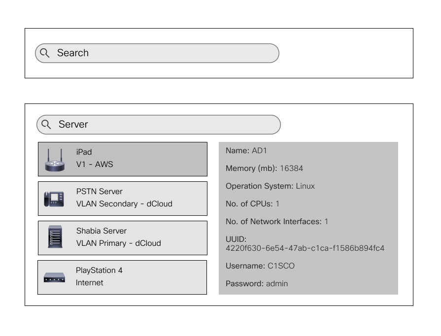
A search modal shows results with info; selecting one highlights it on the diagram and opens its settings.
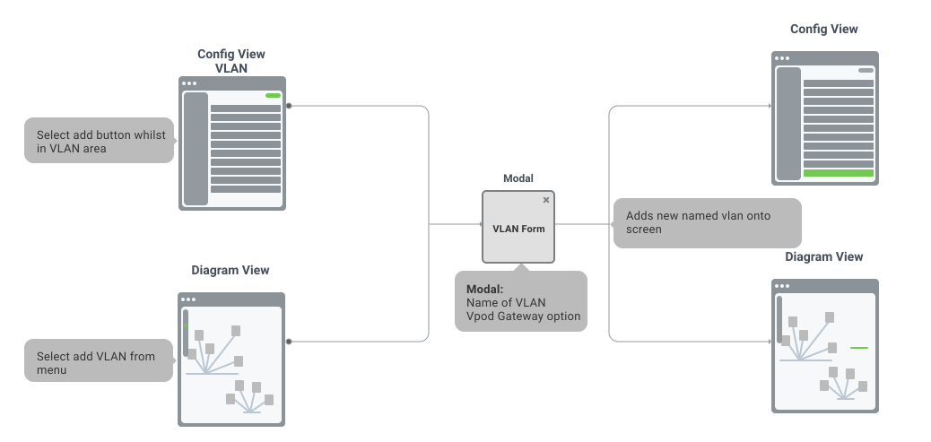
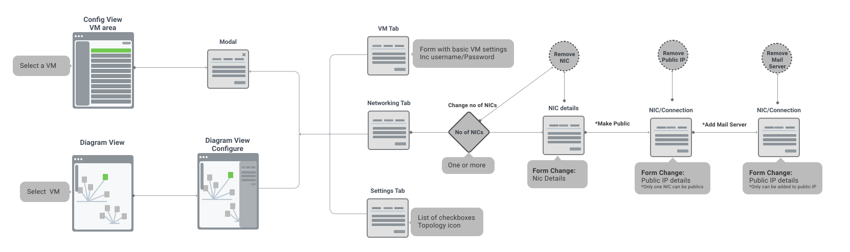
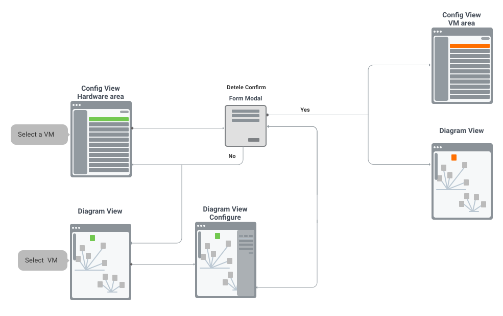
Small examples of the user flows I redrew for the redesign.
Add a VLAN
Add and Configure Virtual Machines
Delete Hardware
Search Diagram
Evaluated → Rejected → Shipped
Decision 1: A floating pill menu, not a fixed sidebar
Problem: the screen was too cluttered for complex topologies
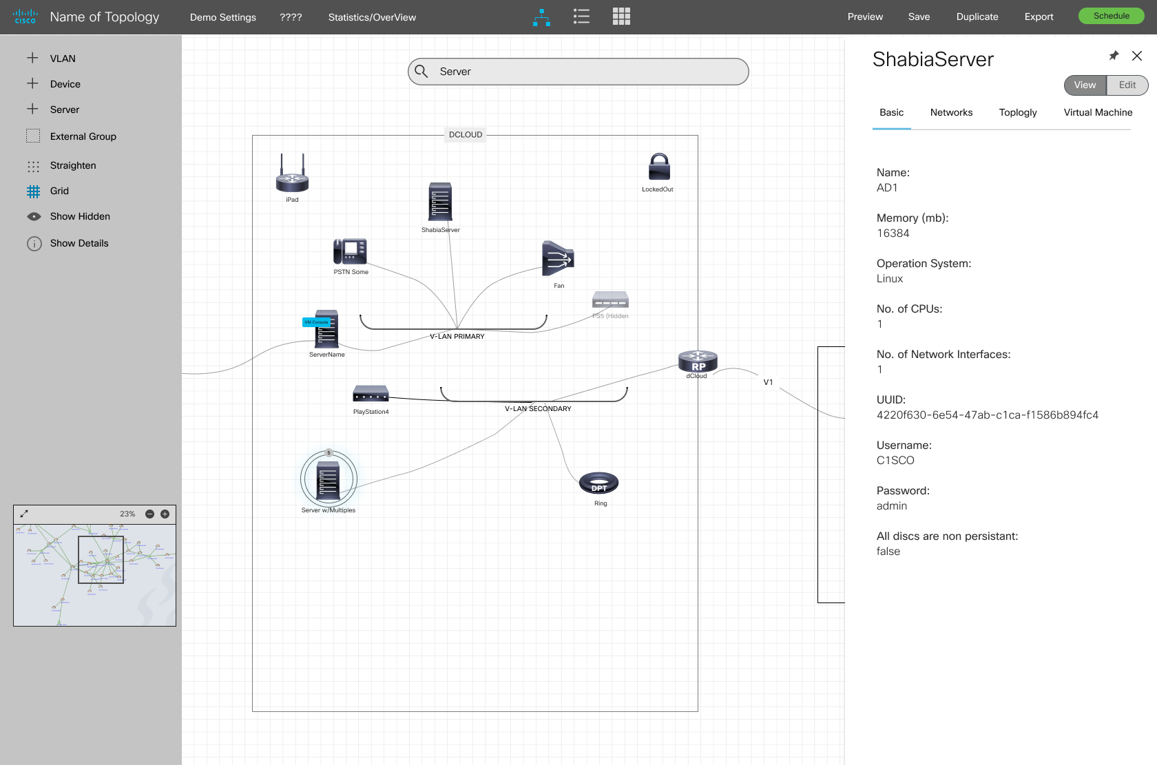
A full left sidebar was clearest to read but ate the canvas — leaving the diagram, the actual point of the tool, tiny.
The first full wireframe kept that fixed, fully-labelled menu and put search directly on the canvas. Everything the user needed was on screen, and tabbed side panels categorised information well — but the menu and search bar left the actual diagram tiny, and the curved connection lines read as visually inconsistent.
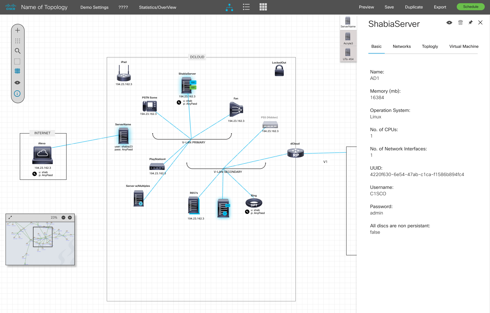
Shipped: a floating pill menu plus a hover zoom panel, with straighter connection lines. Small learning cost on the icons, huge gain in canvas space. The side panel also tabs multiple open devices — a feature users loved.
First iteration — full menu, on-canvas search, curved connections
Second iteration — floating pill, tabbed side panel
“On a diagramming tool, every pixel the UI takes is a pixel stolen from the work.”
Decision 2: Colour connections like a Tube map
Problem: on complex diagrams you couldn't tell which device connected to which VLAN
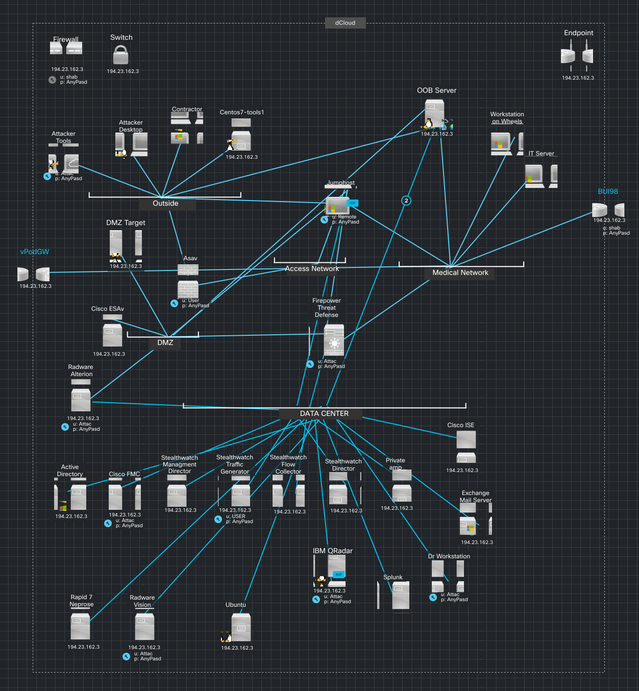
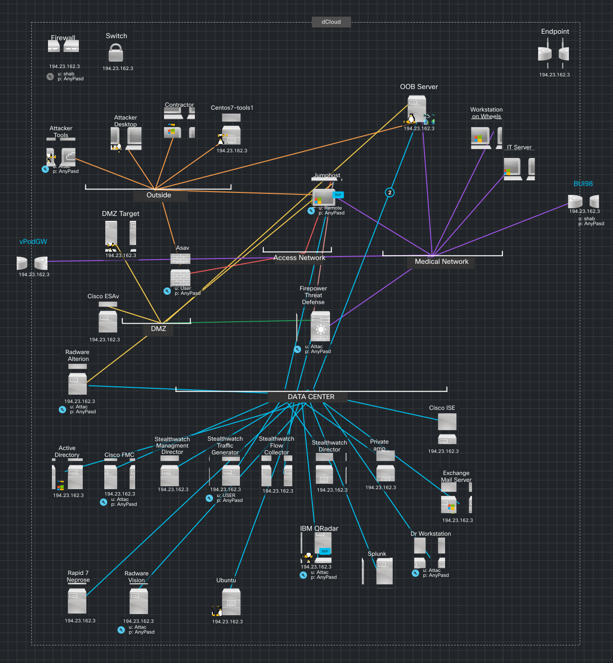
Every connection line looked the same, so dense diagrams were unreadable.
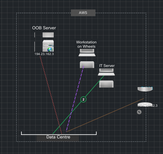
Shipped: borrowing from the London Underground map — alternating line colours plus dashes and dots to distinguish connection types. A dense diagram became scannable.
“The clearest reference wasn't another network tool — it was a 100-year-old transit map.”
Decision 3: A search modal that shows results with context
Problem: no way to find items in a large diagram
I explored four search patterns (highlight-and-zoom, multi-tab, grey-out, modal). Grey-out clashed with hidden items; multi-tab opened too many panels.
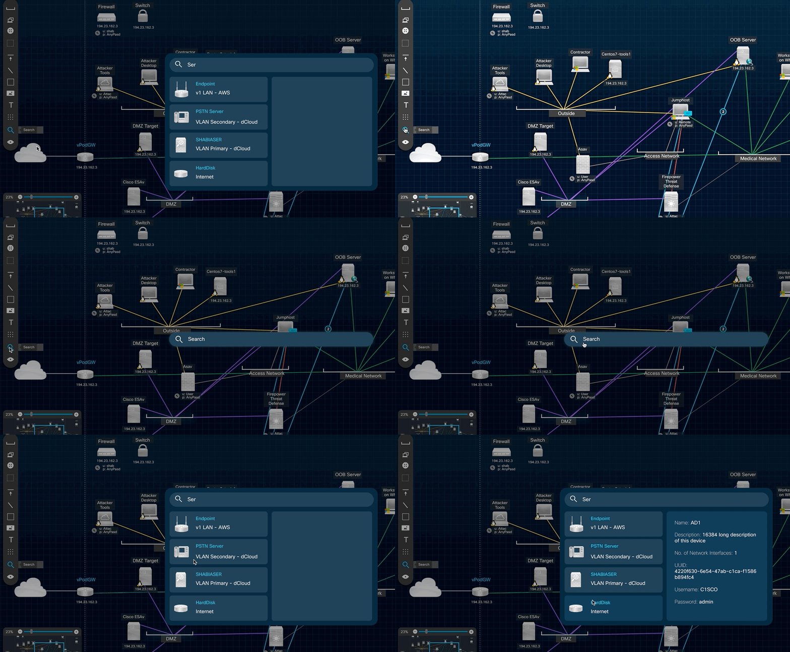
When presenting the search ideas, we decided as a team the modal search was probably the most effective. Search is opened by clicking the search icon on the pill menu.
Flow — mocked up flow diagram for how search would work
Search Popup UI — matched items show up with detailed info to help user make the right choice
Search interaction, in the shipped product
“Opening the selected device in a side panel so users could configure it generated positive feedback from users and business stakeholders.”
Decision 4: Line types and icon states carry meaning too
Problem: colour alone still left two questions unanswered — what kind of connection is this, and what state is this device in?
By alternating line colours there is clarity of how devices and VLANs connect. For line types, dashes and dots were introduced to distinguish connection types further.
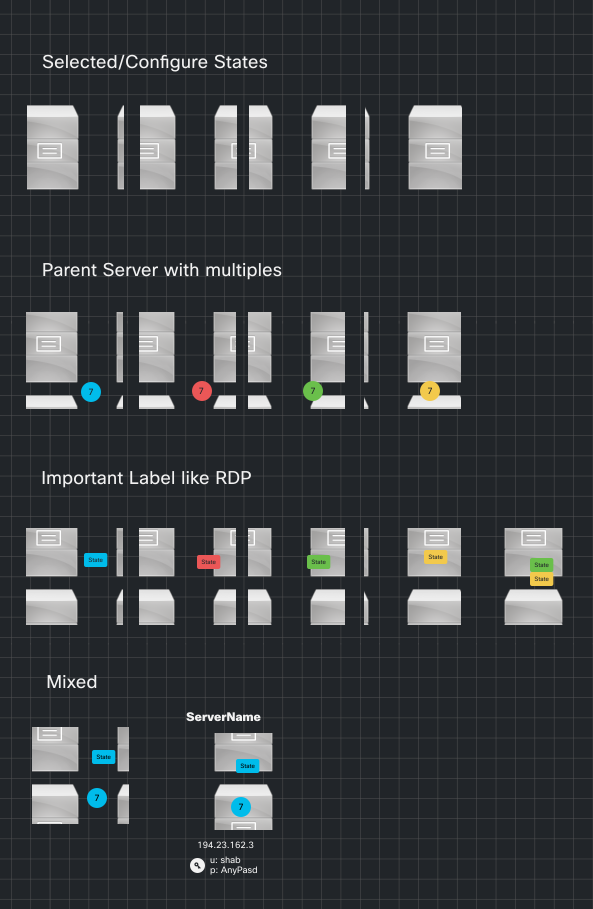
Device icons have different visual states for errors, connections, configuration types etc. I developed several types of states that can be used, so a glance told users what they were looking at.
Line types — dashes and dots for connection types
Icon states — errors, connections, configuration types
“Colour told users which VLAN. Pattern and icon state told them what kind of connection or device they were looking at.”
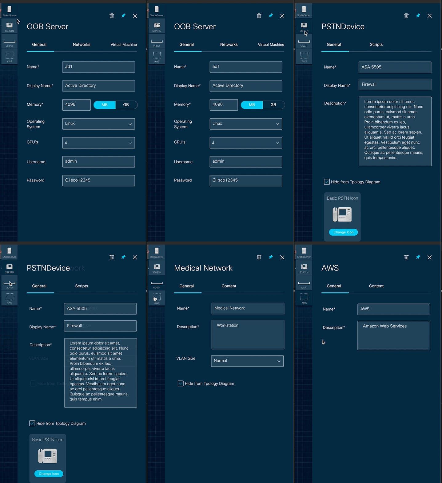
Tabbed right column — interaction demo
Built in Figma on Cisco's UI design language.
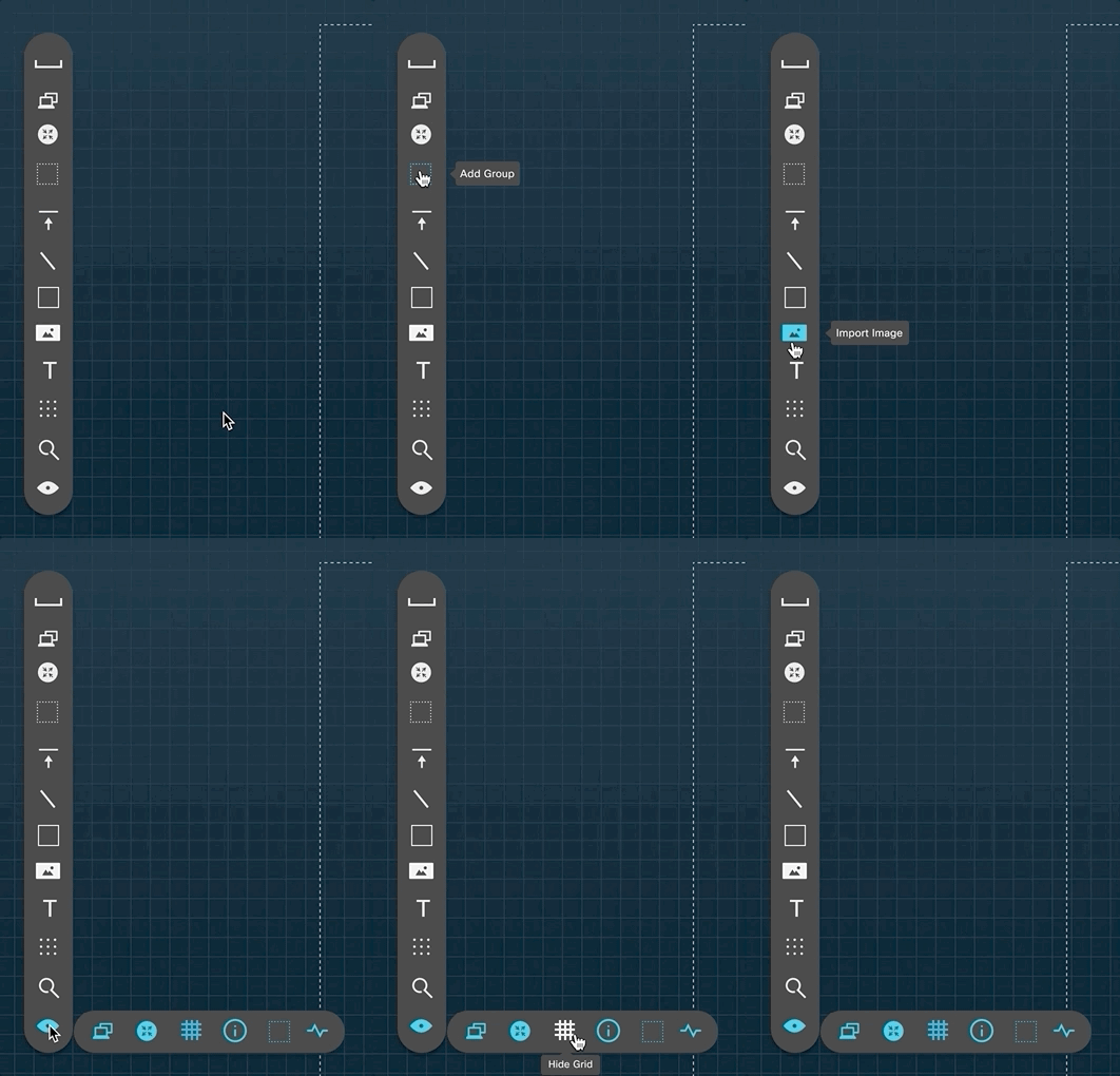
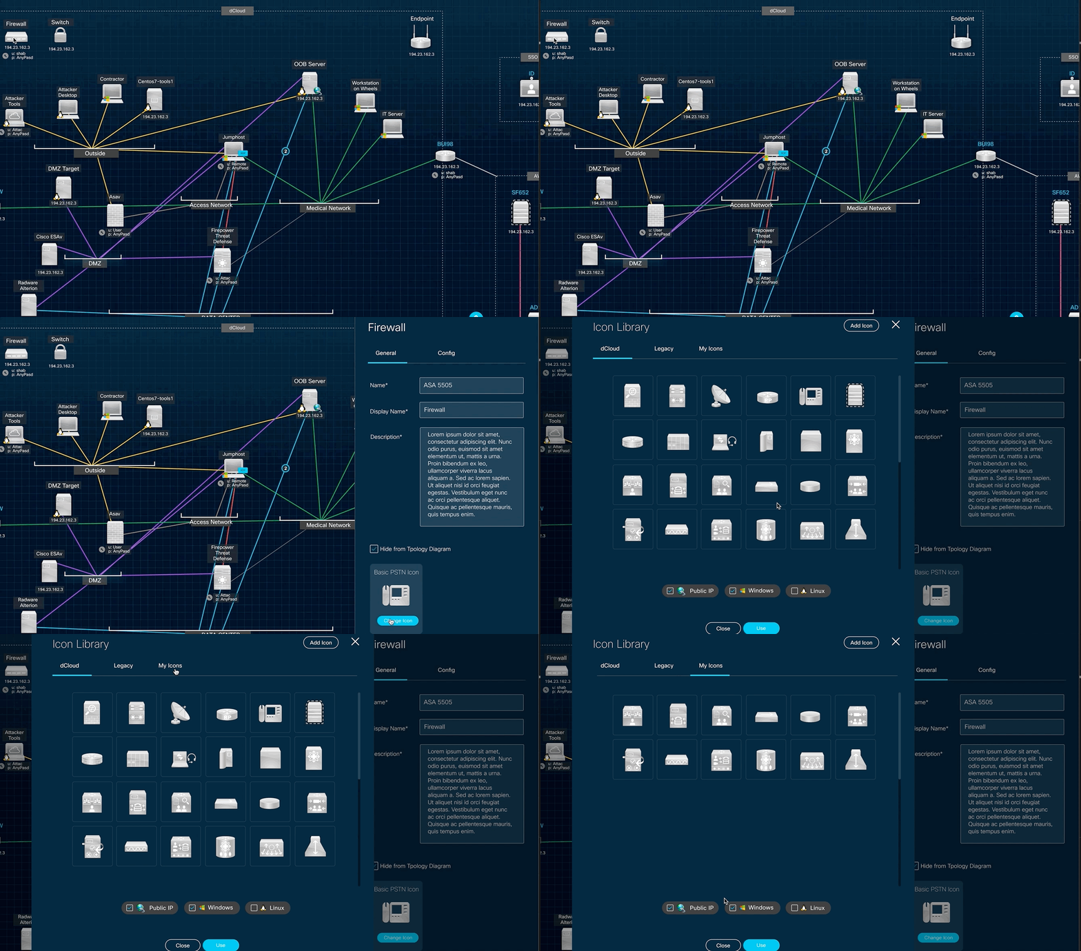
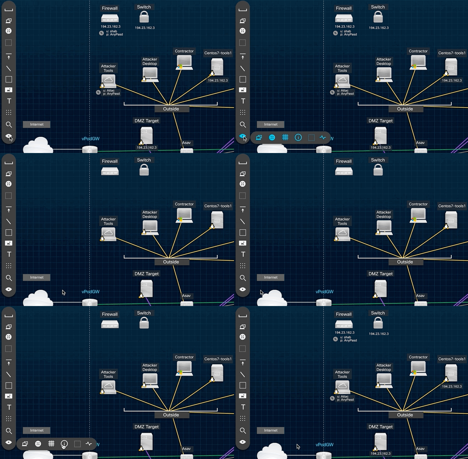
A selection of various UI interactions.
Tabbed right column
Menu function
Change icon
Show/hide details
Some additional screens — this project is really large, with many multiple screens and configurations.
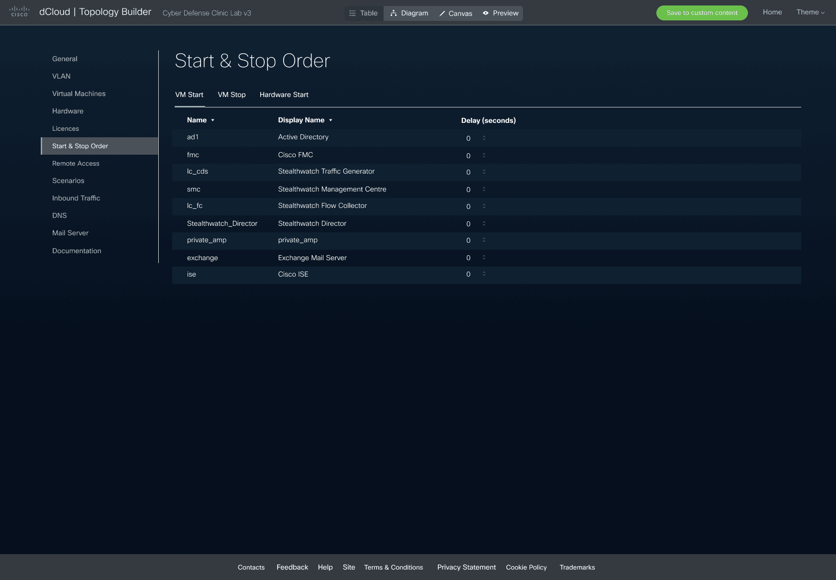
Start & stop order
Configure the order and delay for starting or stopping each VM and piece of hardware in the topology.
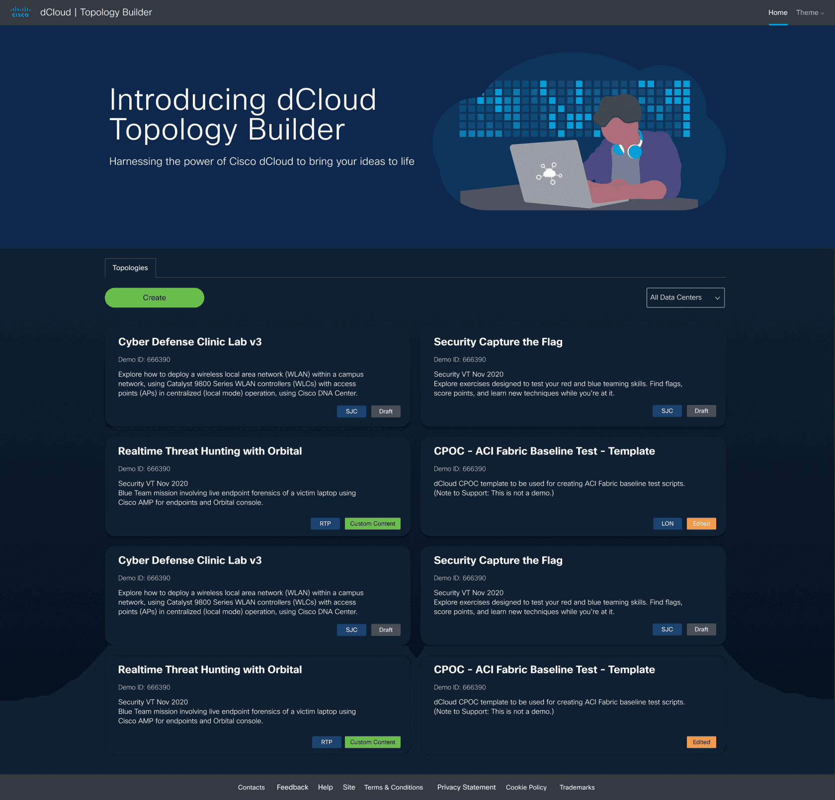
Topology Builder home
Browse, filter and create topologies from the homepage, across all data centres.
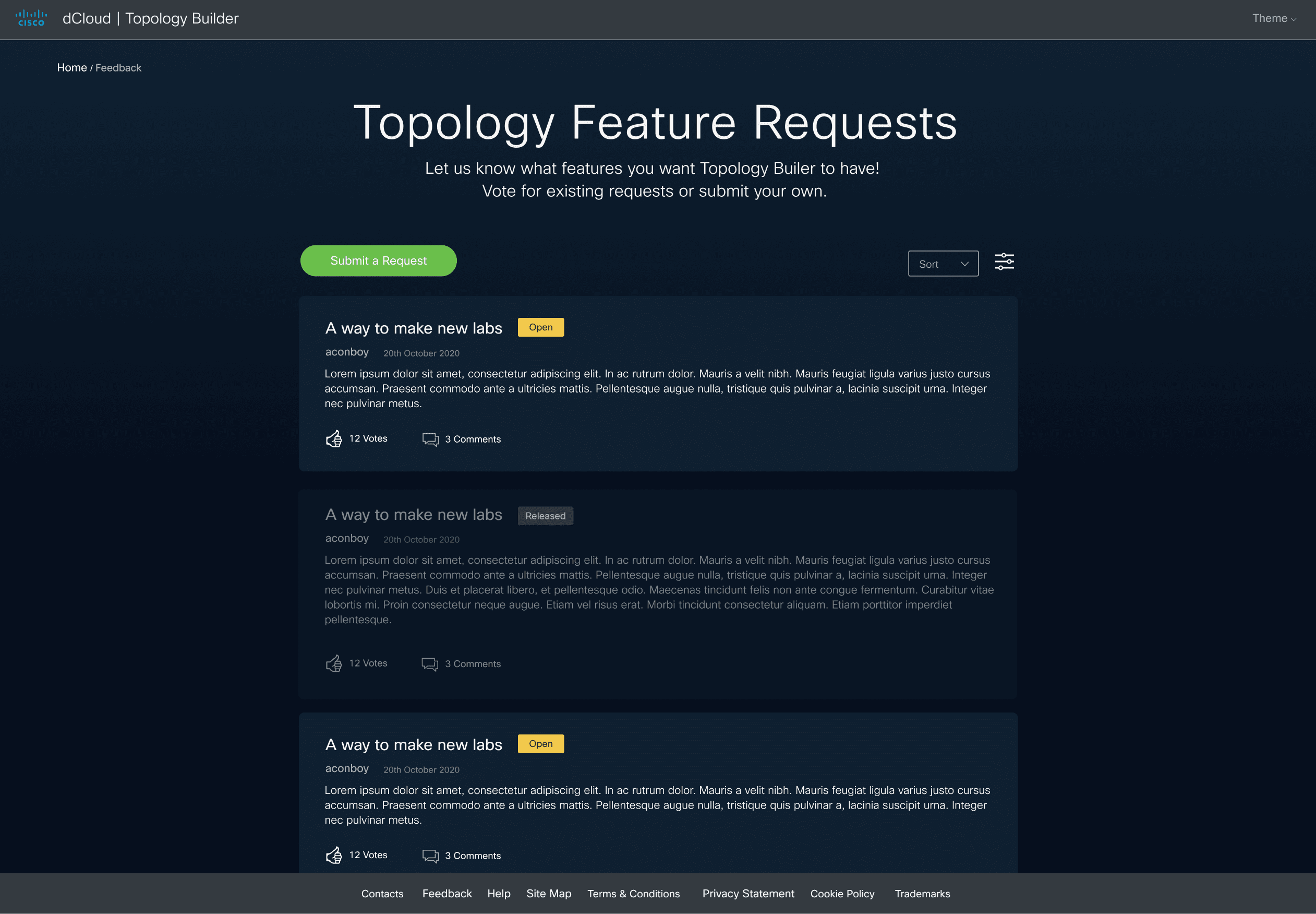
Feature requests
The built-in feedback tool users vote on directly — the same tool that drove this redesign’s research.
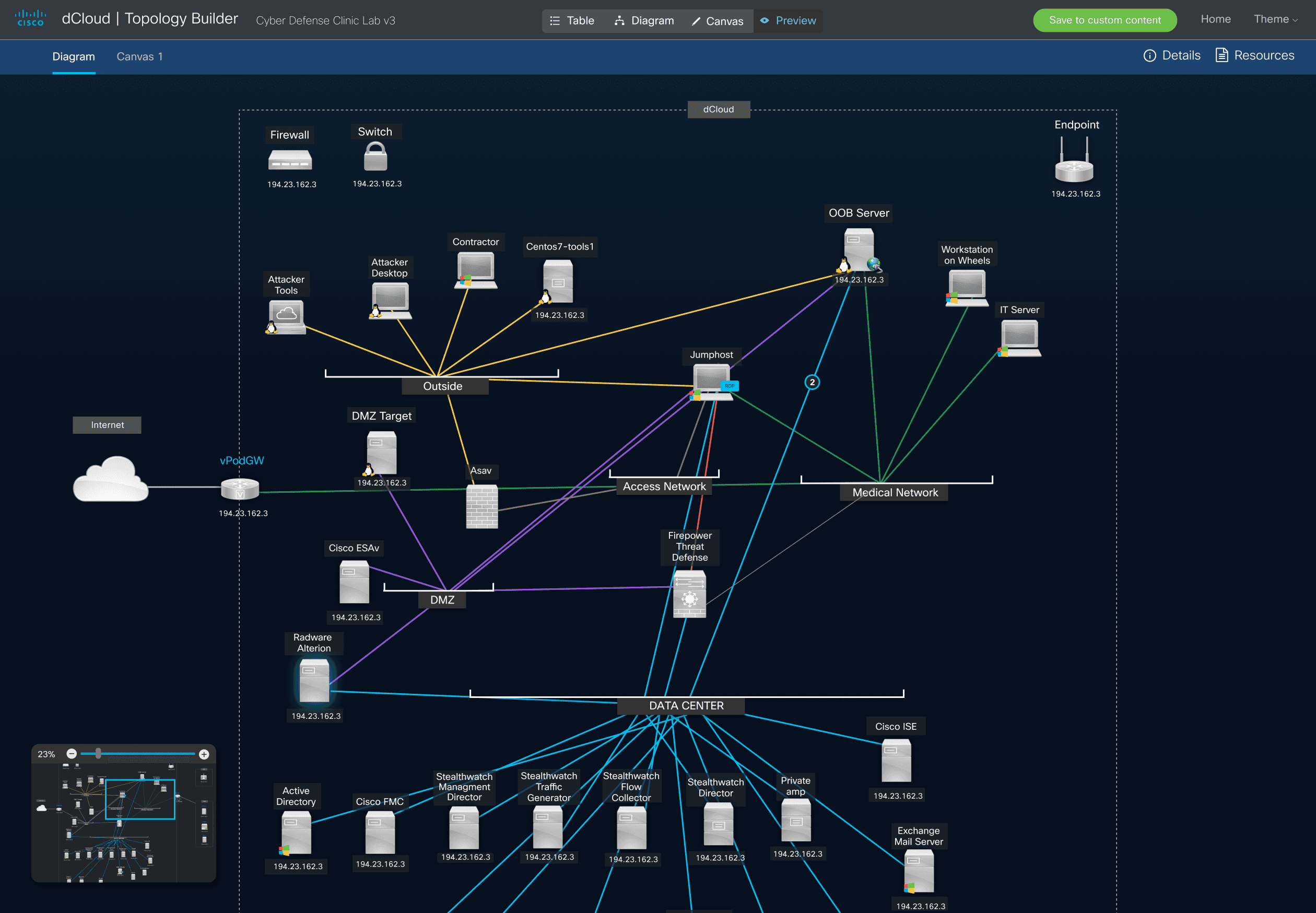
Full diagram preview
The complete canvas in preview mode, with the navigator minimap open in the corner.
READABILITY
Complex diagrams made readable
Colour + pattern connection system
EXTERNAL ENTITIES
Now shown on-diagram
No more missing context
NEW USERS
New user types onboarded
Beyond the original demo-dev audience
APPROVAL
Strong approval
From users and stakeholders
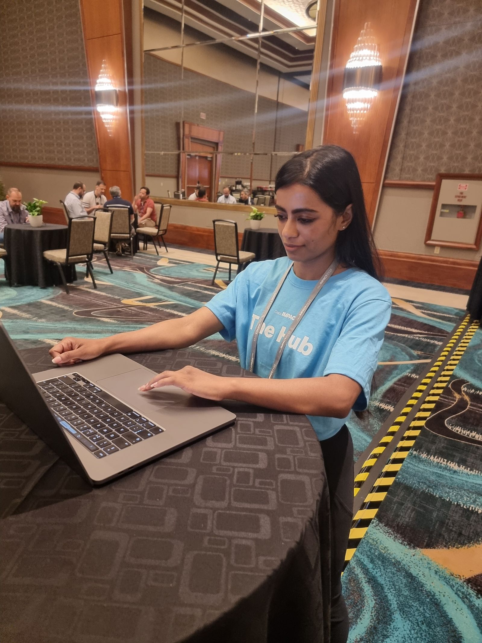
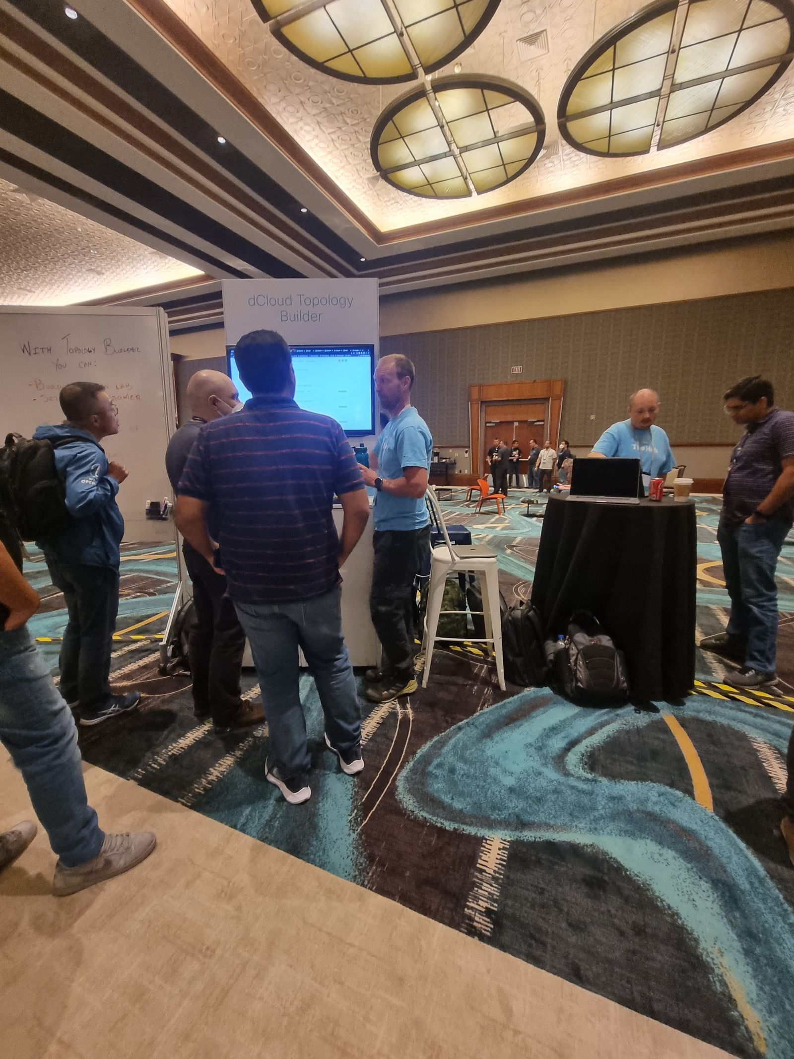
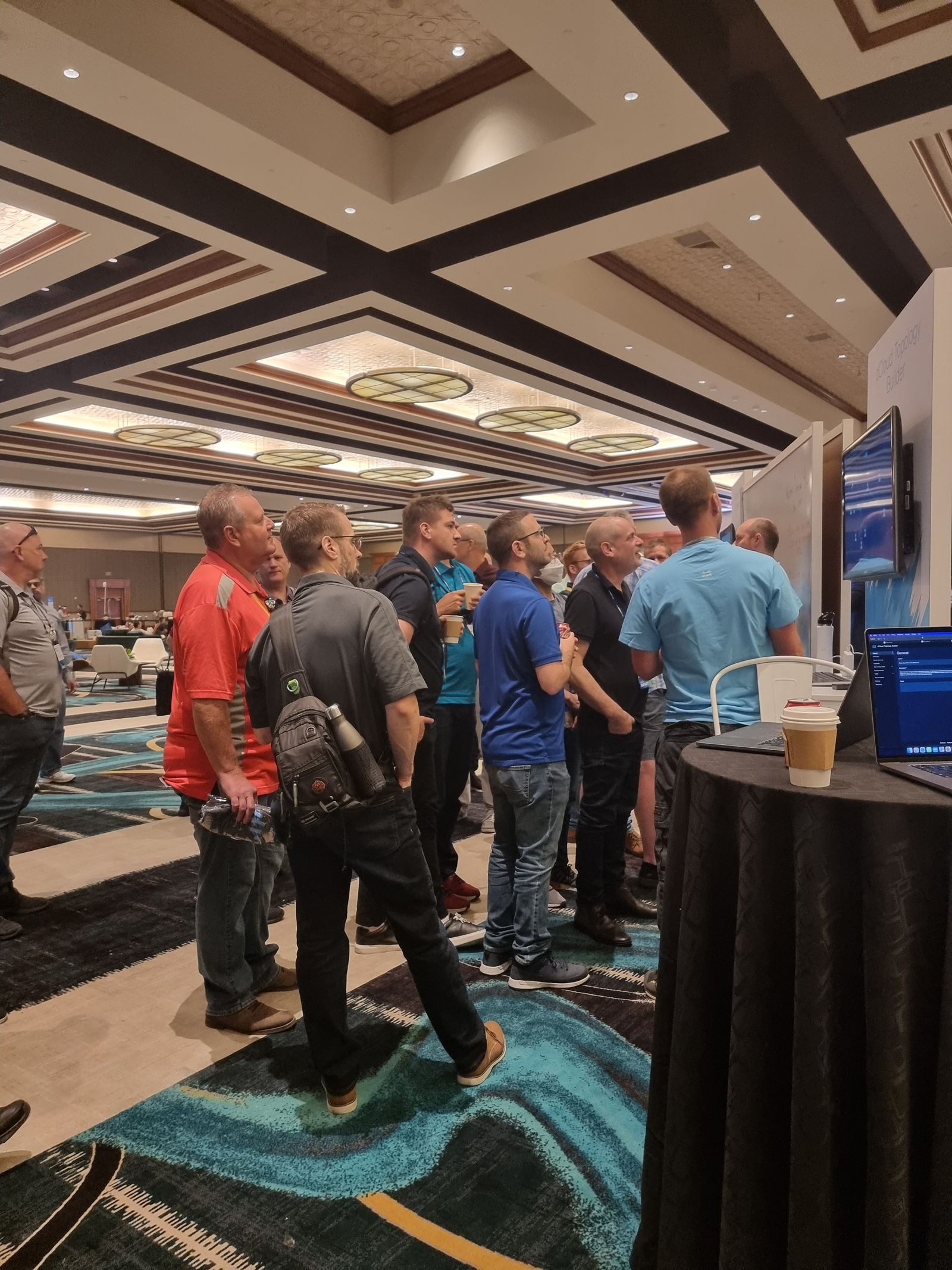
The tool did well enough that the team got its own booth at Cisco Live Las Vegas — attended by 28,000 people from around the world. Users came up to me at the booth to say thank you for building something they genuinely enjoyed using.
What I Learned
Designing for users you can't directly access, under constantly changing requirements, with a two-person design team. Daily UX check-ins and bi-weekly stakeholder reviews were what kept a huge, ambiguous project coherent.
Would Do Differently
See the topologies run in real life. Covid meant we never watched the configurations work in the real world; that would have sharpened how the tool maps to real use.