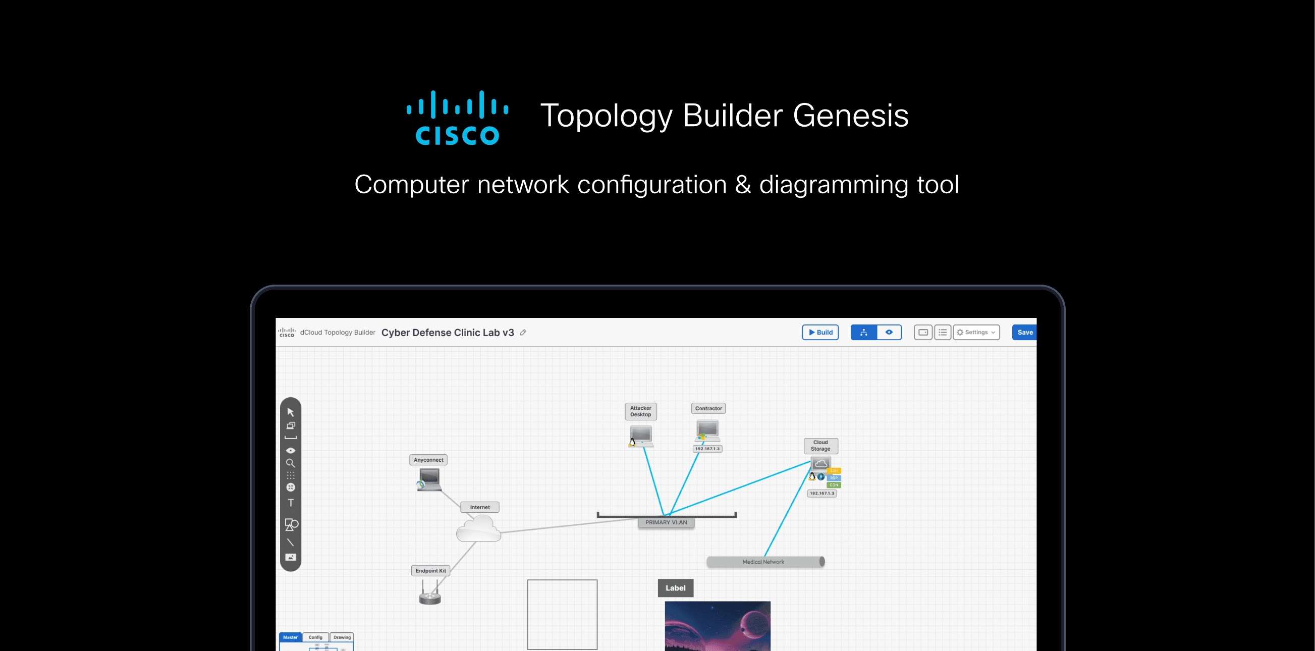
Topology Builder Genesis: canvas for static diagrams and live assets
- ROLE
- Lead UX Designer (the diagram / drawing view)
- TEAM
- Co-designer (table-config view) · product manager · project manager
- MEDIUM
- Desktop web app
- TOOLS
- Figma · Miro · iPad + Adobe Sketch
- CLIENT
- Cisco (dCloud)
- STATUS
- Shipped; being prepared to sell as standalone software
TB Genesis
Shabia designed Topology Builder Genesis, a Cisco dCloud tool combining static drawings and live network assets on one canvas, users grew 10.4k to 31.9k.
METRIC 01
Users 10.4k → 31.9k
Cisco dCloud signup data
METRIC 02
Projects 21.3k → 56.9k
Cisco dCloud signup data
METRIC 03
First tool of its kind
No existing precedent to benchmark against
Topology Builder had taken off (users grew from 10,422 to 31,867 and projects from 21,316 to 56,863) and users wanted more: to draw a full solution, not just configure live assets. But adding static drawing created one hard problem.
The core challenge: static drawings and functional network assets look identical on the canvas. How does a user always know which is which, without cluttering the tool or making it harder to learn?
What the feature-request tool told us
Method
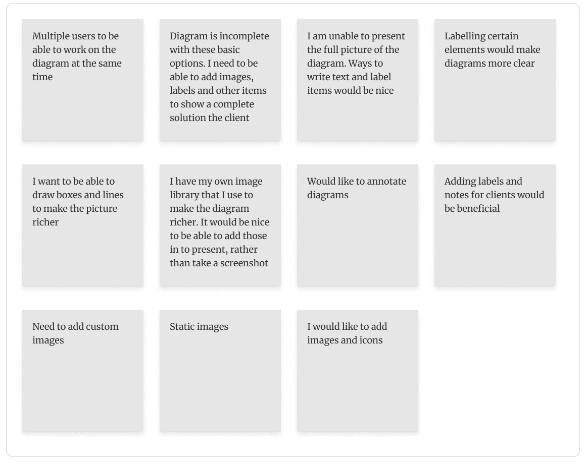
A built-in feature-request tool with upvoting told us exactly what to prioritise, diagramming, import/export, enhancements, ranked by the users themselves. I then interviewed users who'd left emails to go deeper.
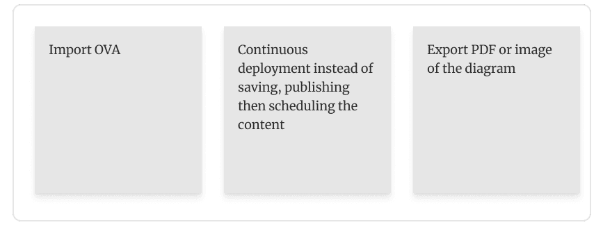
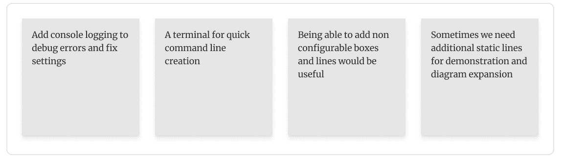
Frustrations
Motivations
Problem → solution, mapped
Finding 1
Add labels
Refined solution
text tool
Finding 2
Draw boxes
Refined solution
box tool
Finding 3
Add static images
Refined solution
upload & insert
Finding 4
Tell diagram types apart
Refined solution
view modes (the real problem to solve)
The first three were straightforward. The fourth, differentiating static from functional, was the design problem this case study is about.
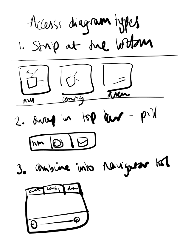
I sketched the hard part first: how to let users see, and switch between, static and functional layers, before committing to wireframes.
View options
Menu tools
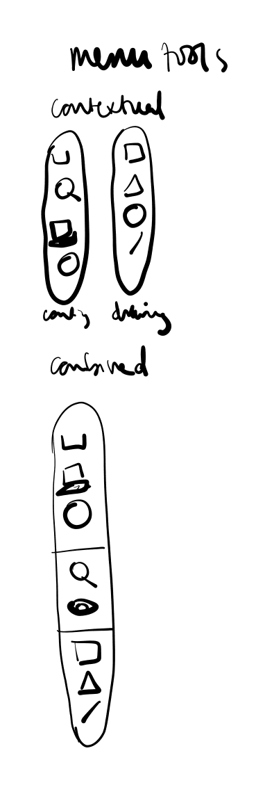
Drawing tools
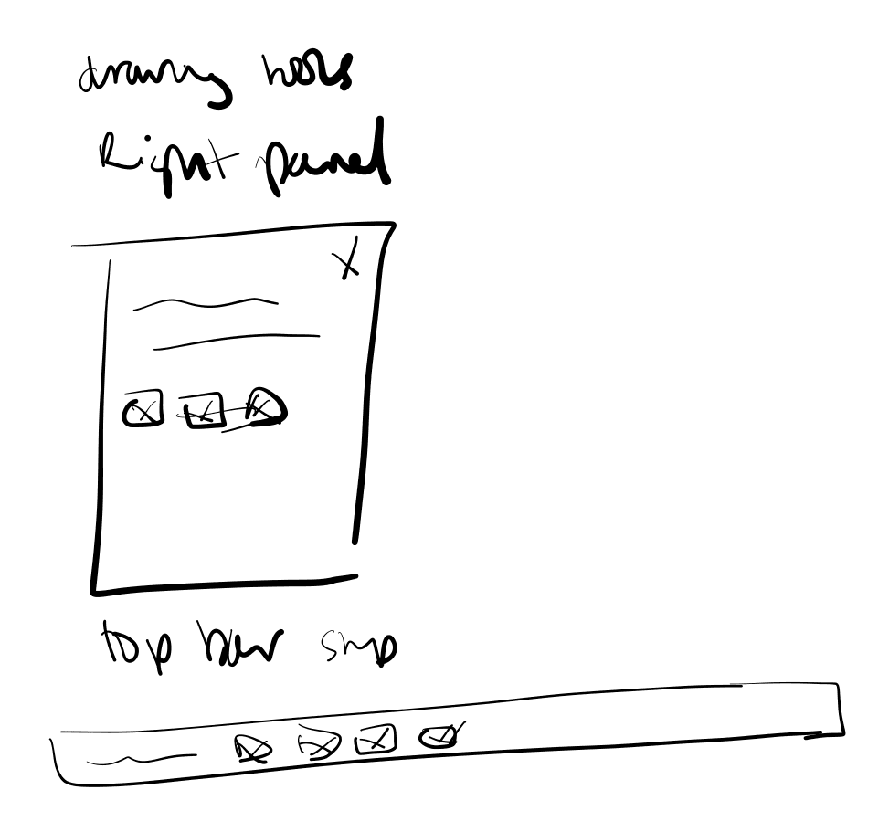
Evaluated → Rejected → Shipped
Decision 1: Separate views, switched by the zoom tool
Problem: in a combined view, static and functional items are indistinguishable
I prototyped three switchers: a bottom strip, the navigator zoom tool, and a top menu. The bottom strip was the clearest, and users said so, but it ate screen space and blocked room for future features like a terminal.
Shipped (validated in testing): the zoom-tool switcher. It takes the least space, sits contextually with the other view controls, and leaves the strip and top bar free for features still to come. Users move between a Master (all-in-one), Config, and Drawing view; once fluent, they work in the combined view.
“The clearest option isn't automatically the right one: I picked the one that still worked two features from now.”
Decision 2: A contextual tools menu, not one giant menu
Problem: one menu holding every tool was cluttered and confusing
An all-in-one menu was overwhelming; users couldn't tell what applied to what.
Shipped: the menu changes with the view. Drawing tools sit in Drawing, network tools in Config, and both are cleanly separated (greyed where unavailable) in Combined. Concise, less clutter, and room to grow as features are added.
Combined
Config
Drawing
“A menu that shows everything shows nothing. Context does the filtering the user shouldn't have to.”
Decision 3: Drawing options in a top bar, not the side panel
Problem: editing a static line looked the same as editing a live connection
When any item was selected, settings opened in the right panel, so a static line and a functional VLAN connection looked identical to edit.
Shipped (confirmed in testing): static drawing options open in a top bar, network settings in the side panel. The location itself tells the user which kind of thing they're editing.
“Where a control appears can carry meaning. Position told users what type of item they had, before they read a word.”
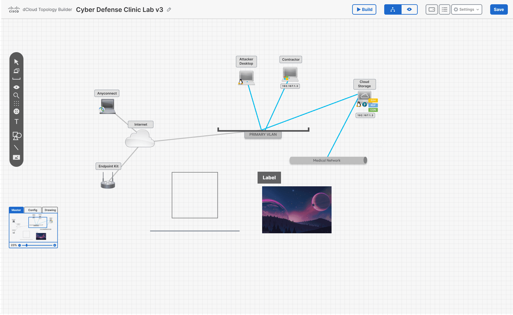
Master, Config and Drawing views, interactive prototype
Built on Cisco dCloud's Magnetic UI design language.
Configure live network assets in one view, then use text, box, line and image tools to build a complete, client-ready picture on top of it.
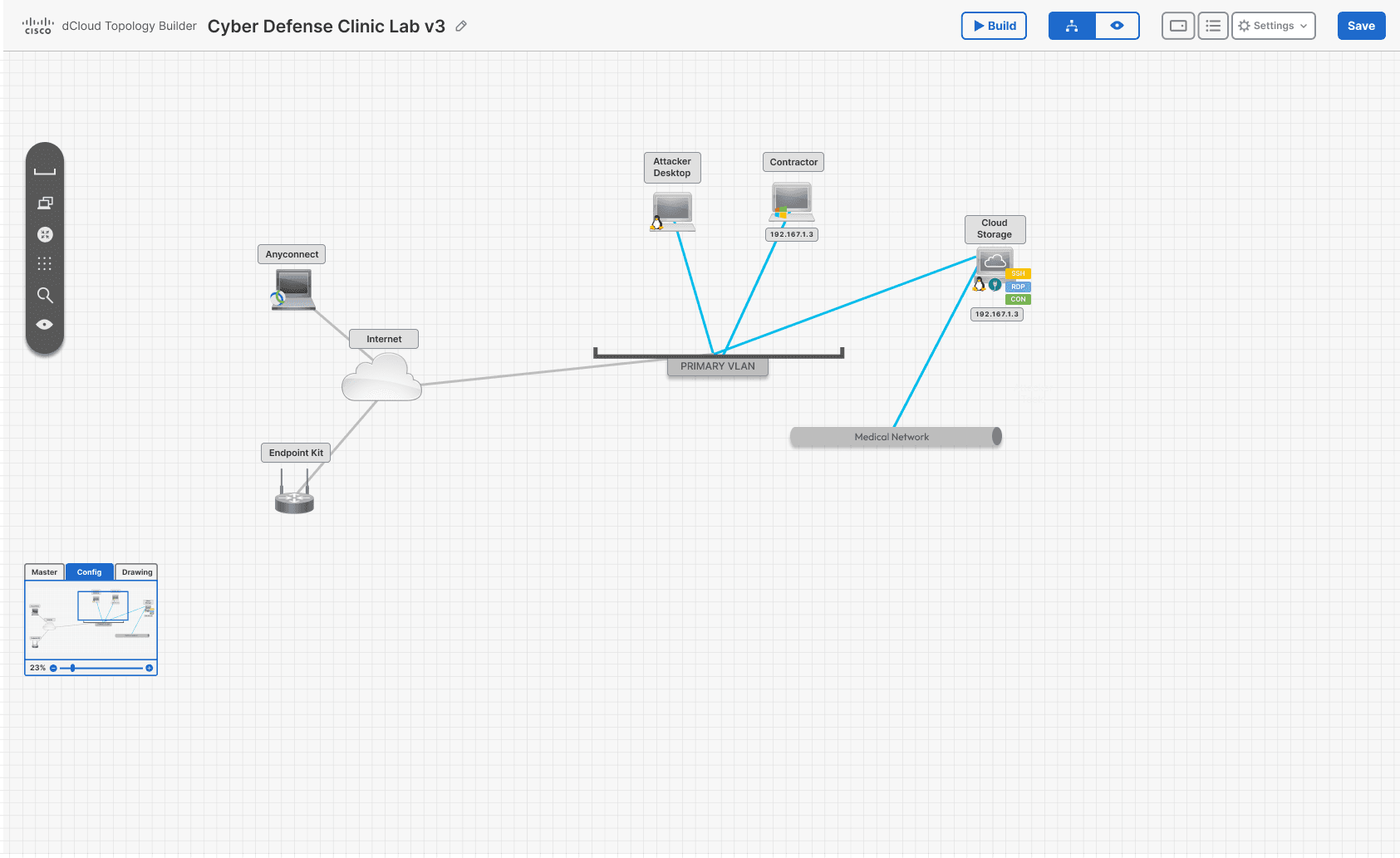
Config view
The functional-network view: configure live assets like VLANs, endpoints and cloud storage, separate from the static drawing layer.
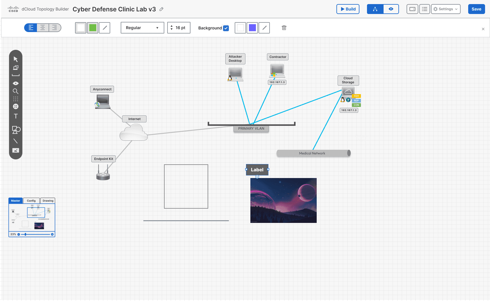
Label tool
Text annotations users add directly onto the diagram.
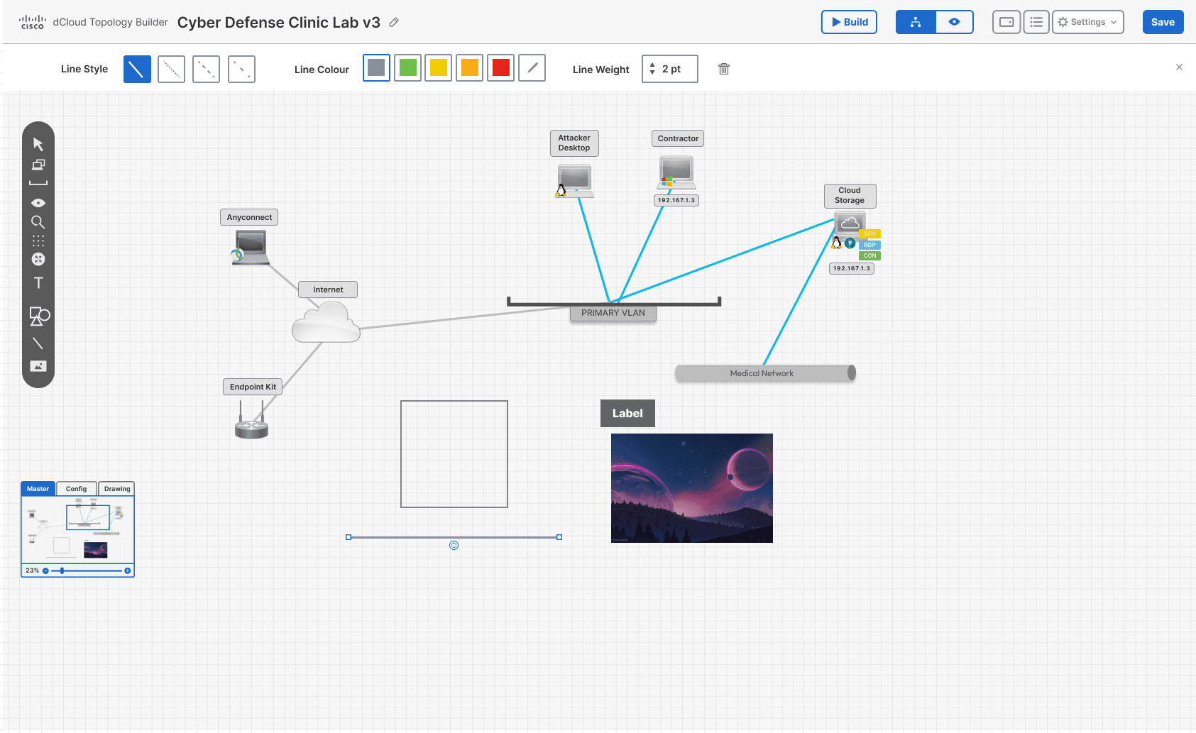
Line tool
Freehand connections for non-functional, illustrative relationships.
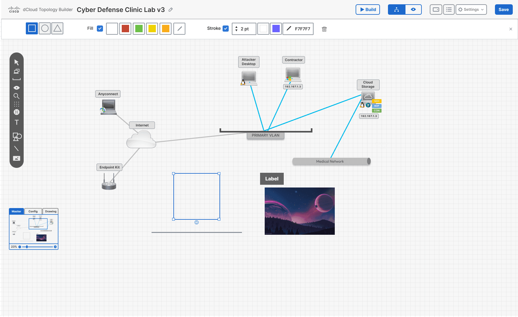
Box tool
Groups and boundaries for structuring a full client-ready picture.
USER GROWTH
10,422 → 31,867
Cisco dCloud signup data
PROJECT GROWTH
21,316 → 56,863
Cisco dCloud signup data
RECEPTION
Well received
By users and business
TRAJECTORY
Standalone software
Positioned to sell separately
What I Learned
Designing something with no precedent means you can't measure against competitors; you test, watch, and let users choose between inventions. The feature-request voting tool made prioritisation objective instead of opinion.
Would Do Differently
Push the visual style further. It conformed to the UI kit, but I think the tool could look more appealing within those constraints.